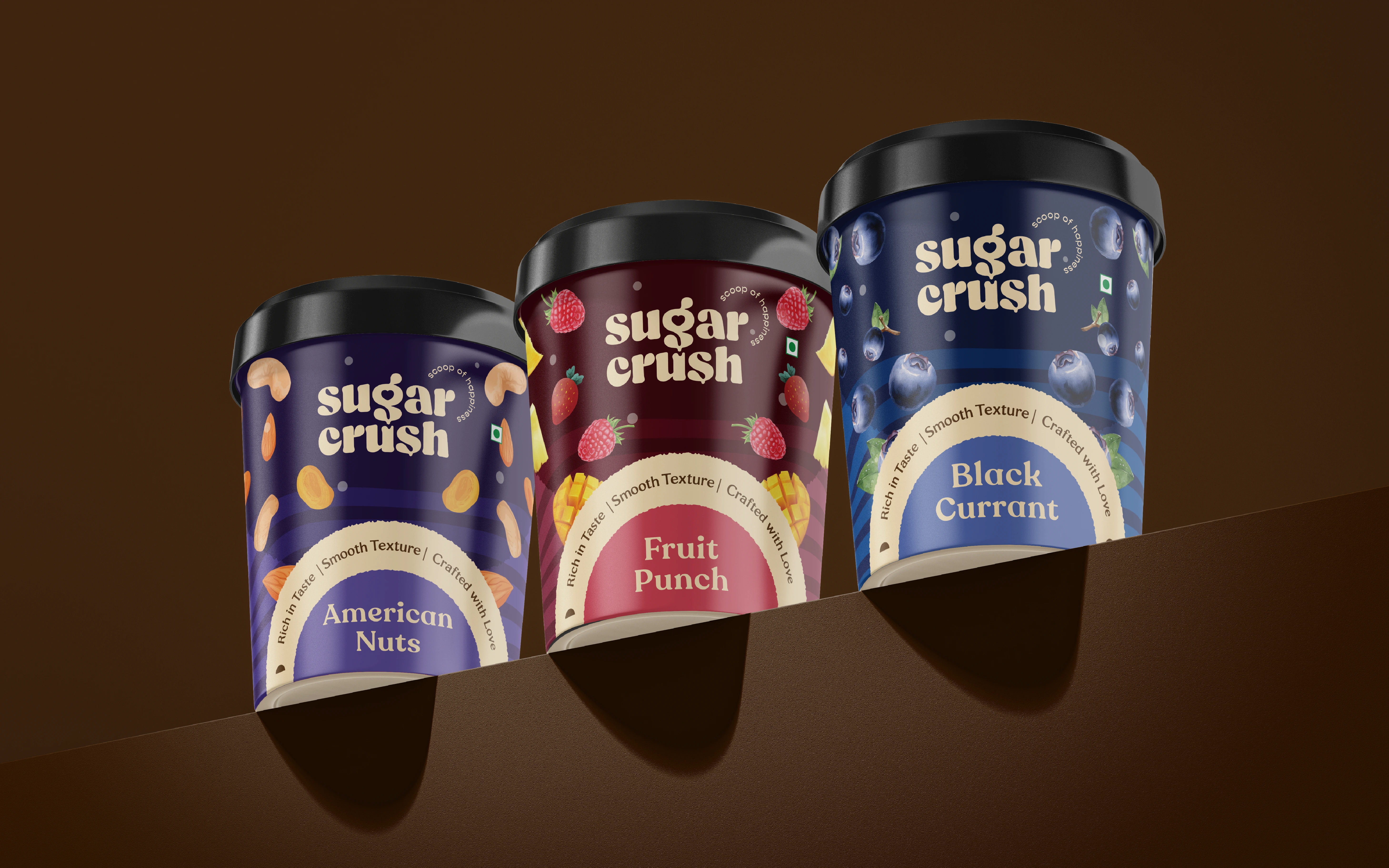
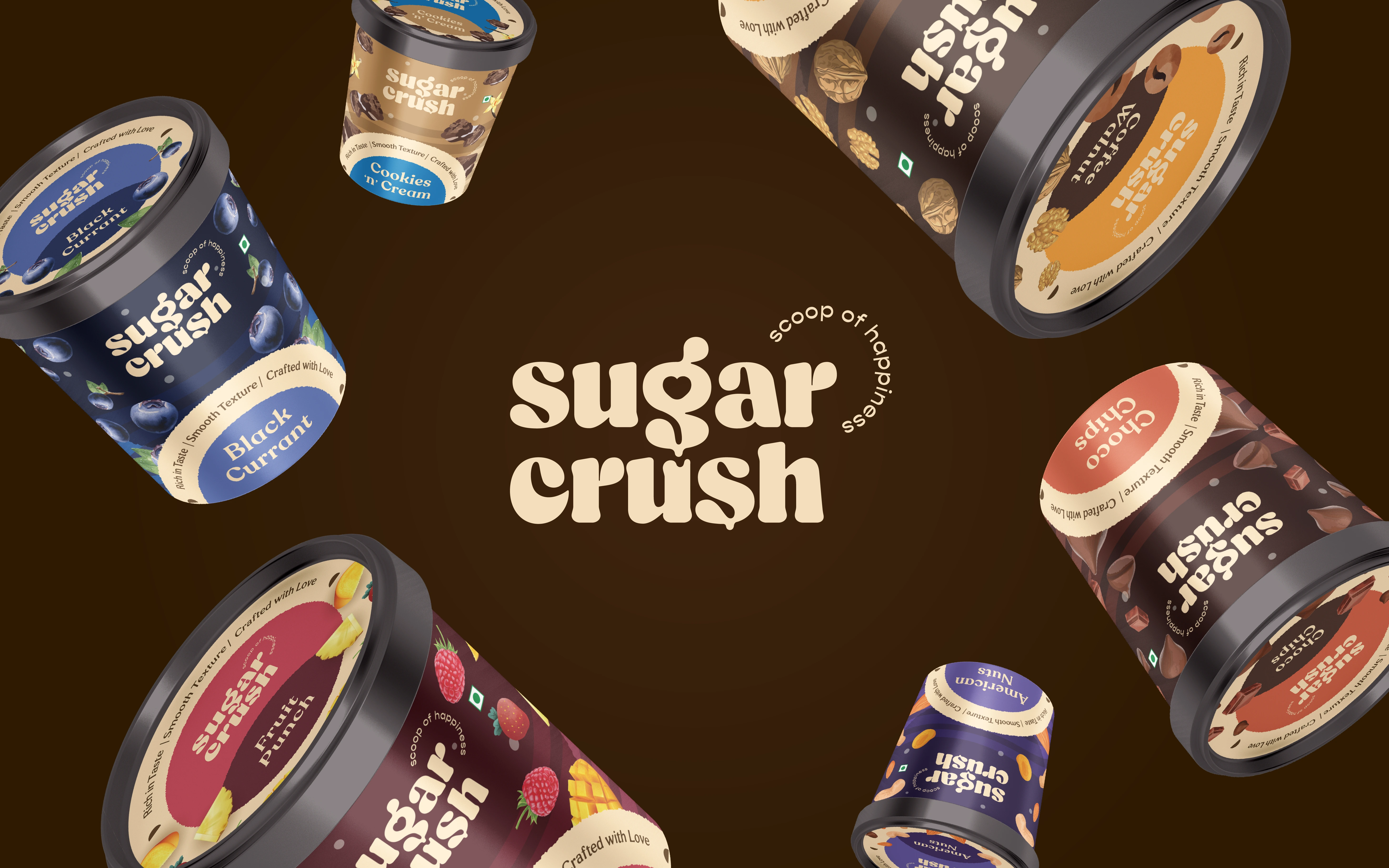
What started as an ice cream parlour in a Tier 2 town in Chhattisgarh is now ready to compete with national and international brands in the market. Sugar Crush is a mass-premium ice cream brand catering to prominent cities of Chhattisgarh including Bilaspur and Raipur. They craft insanely delicious ice cream with some unique flavours like Coffee Walnut and all your favourite flavours - American Nuts, Cookies N Cream, Choco Chips, Black Currant, etc.
Services: Logo | Brand Identity | Packaging
Sector: FMCG
Challenge:
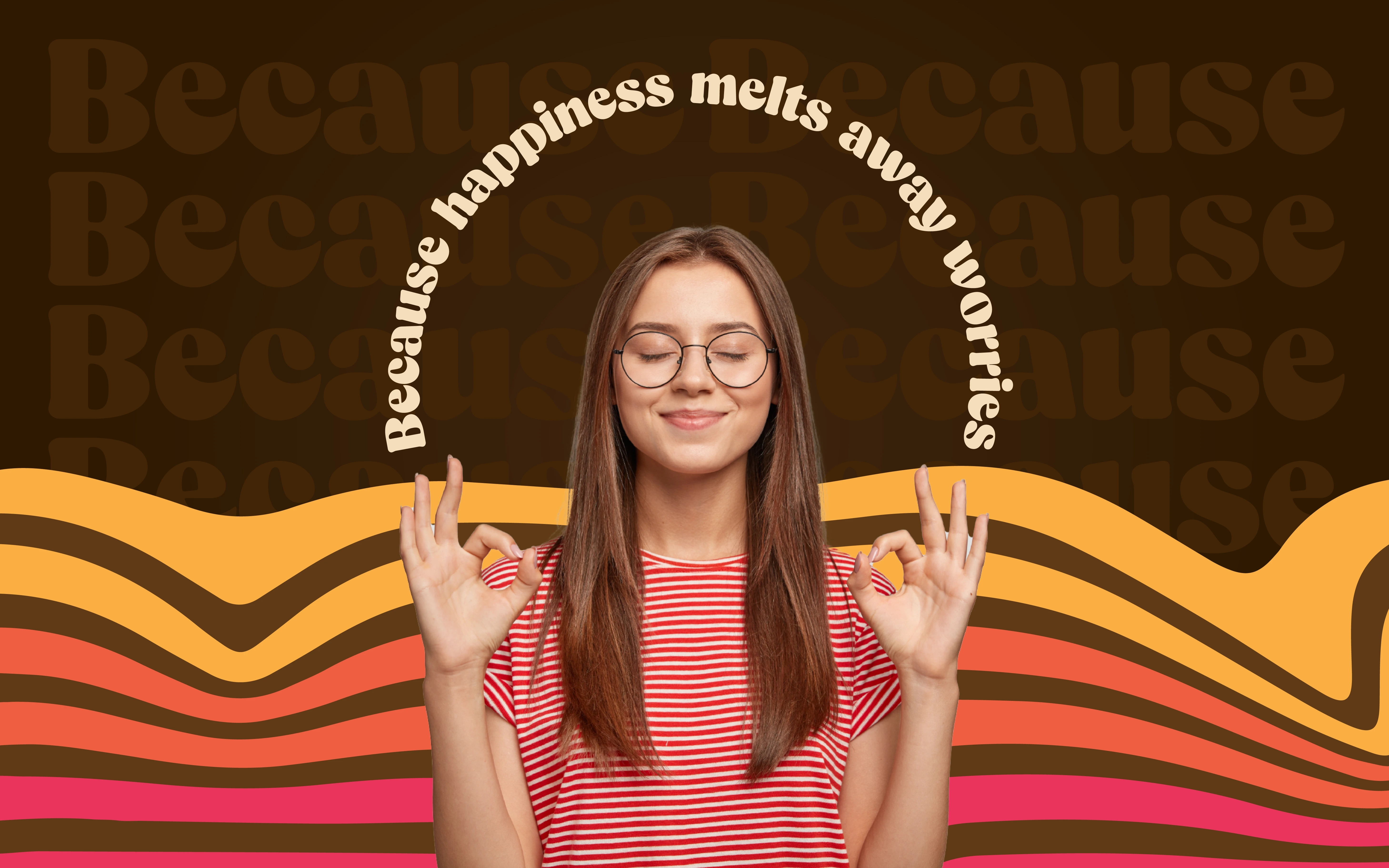
How can you effectively convey the authenticity of ingredients & joy in an ice cream brand?
Solution:
By putting ingredients at the face of the product.
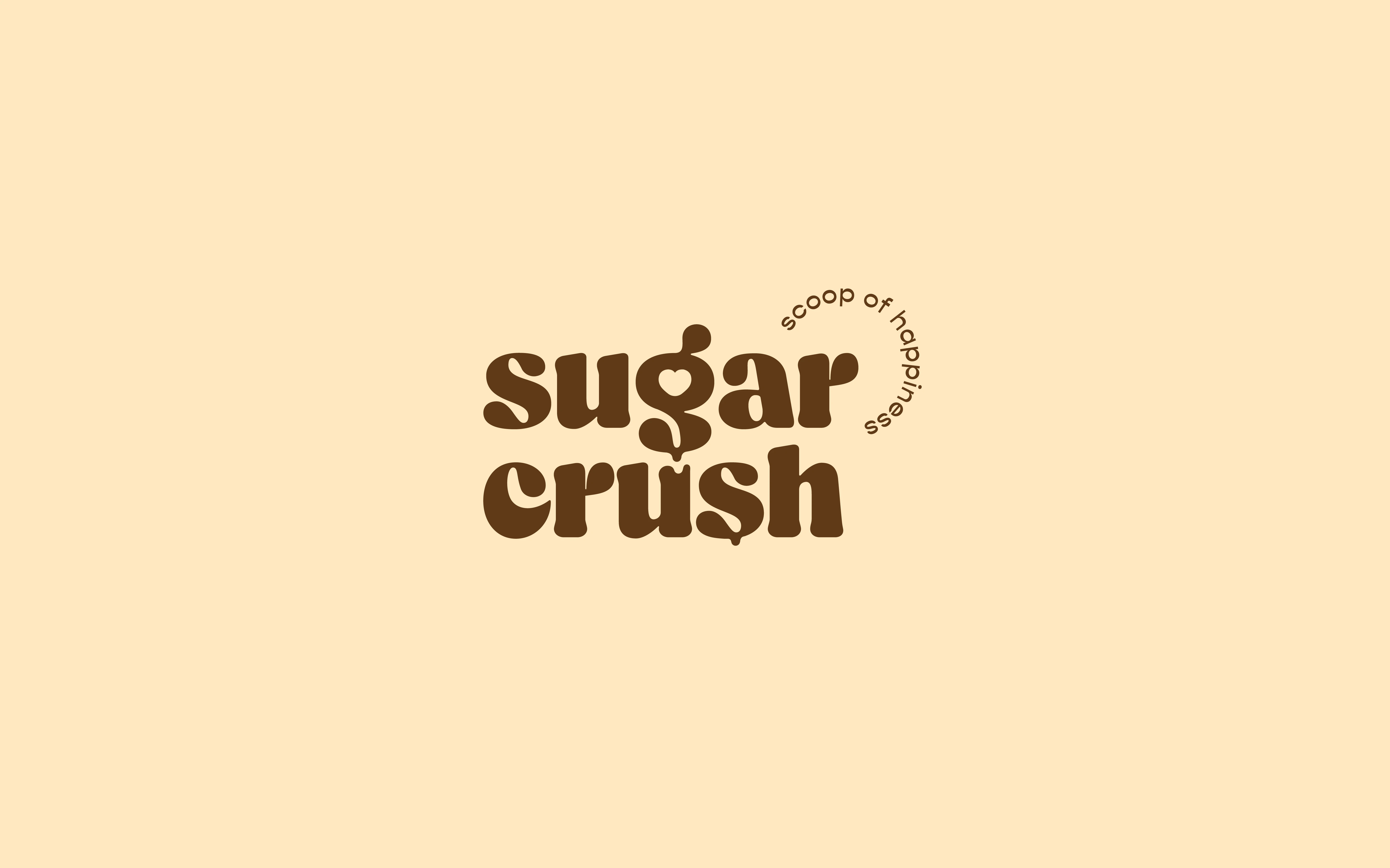
Fun-loving Logo highlighting the love for ice cream
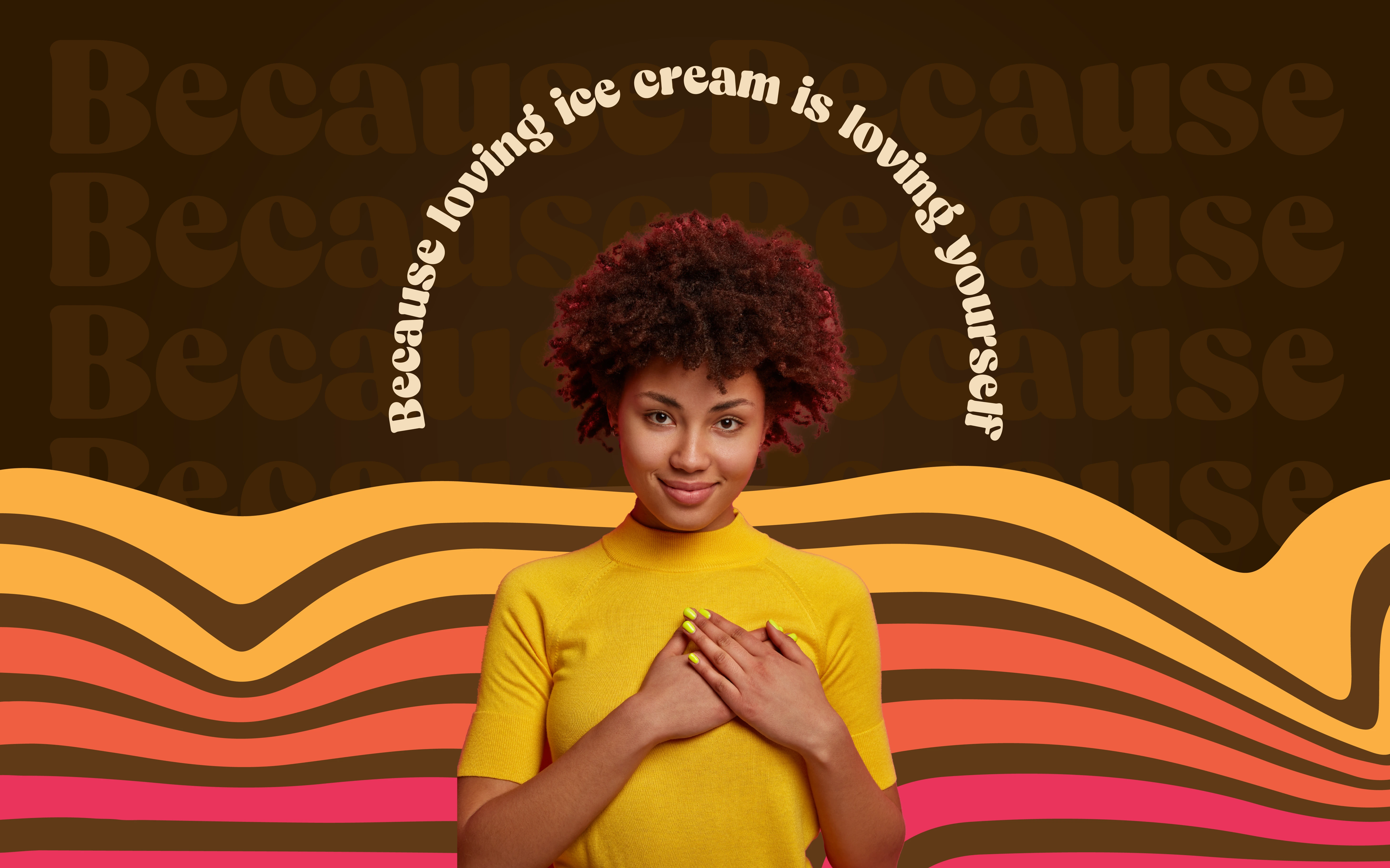
We designed a Wordmark Logo that seamlessly incorporates a heart within the letter ‘g,’ symbolising a love for ice cream. To enhance this sentiment, we added a playful, melting effect to letters like ‘u’ and ‘s,’ capturing the irresistible charm and joy that ice cream brings.
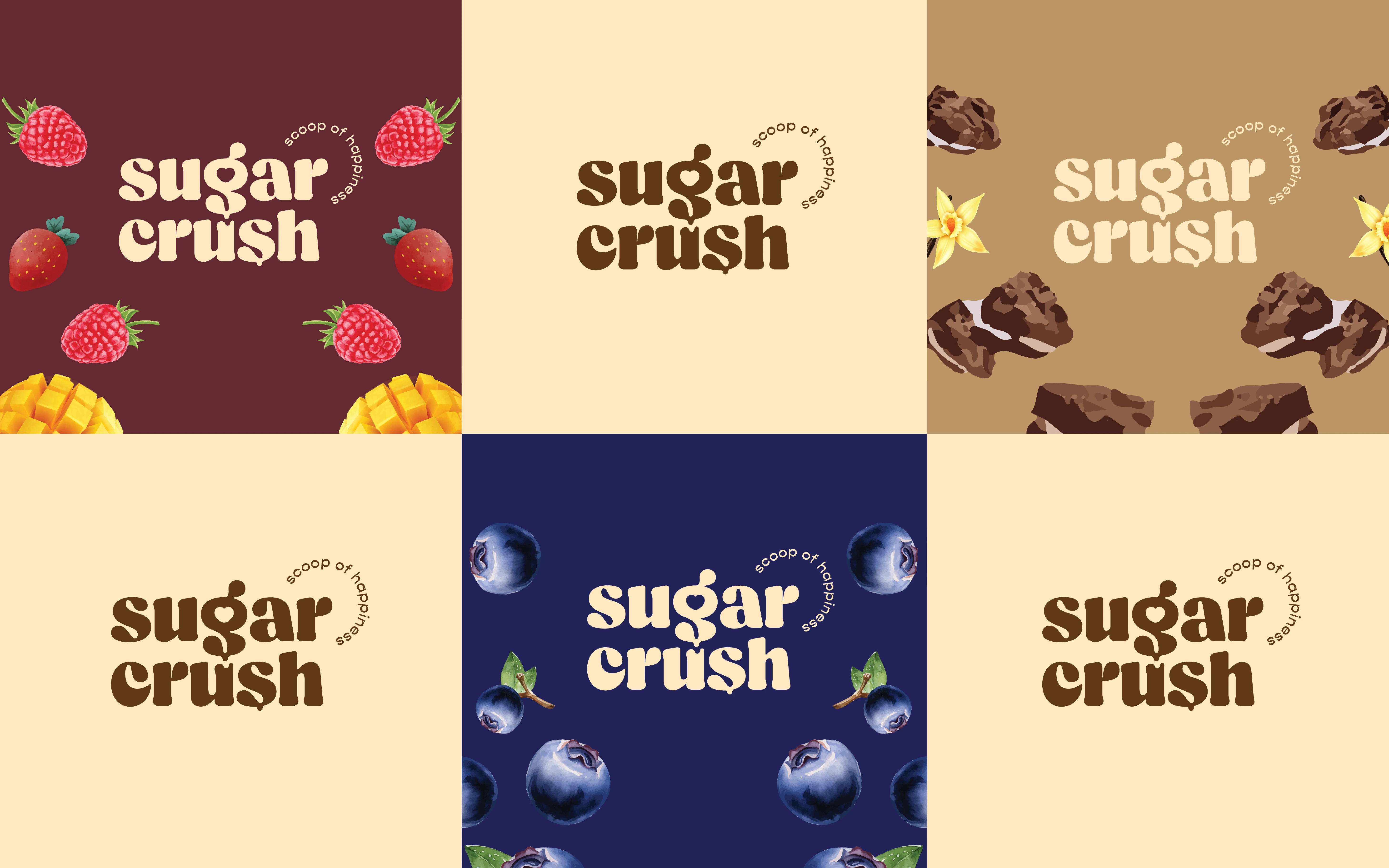
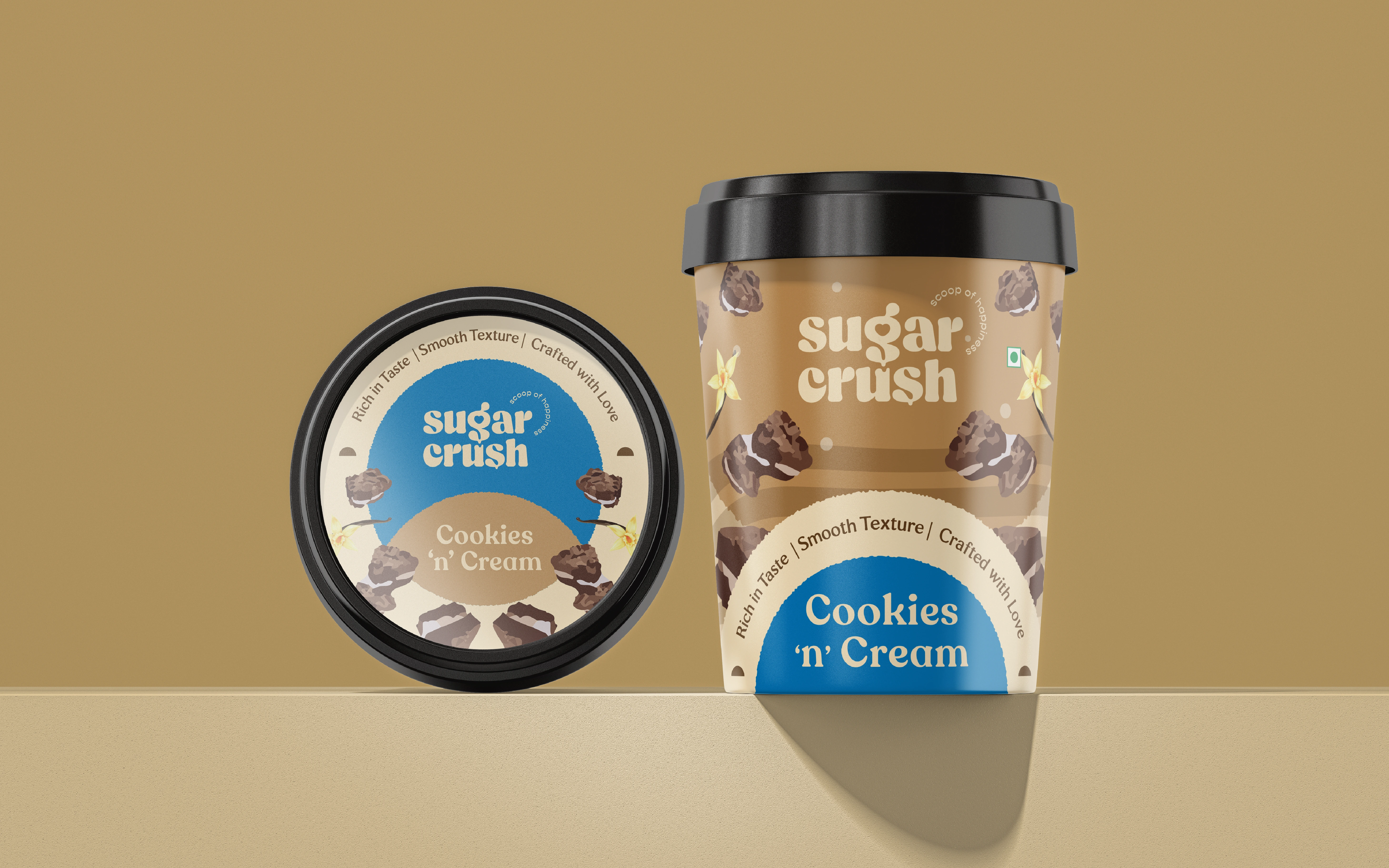
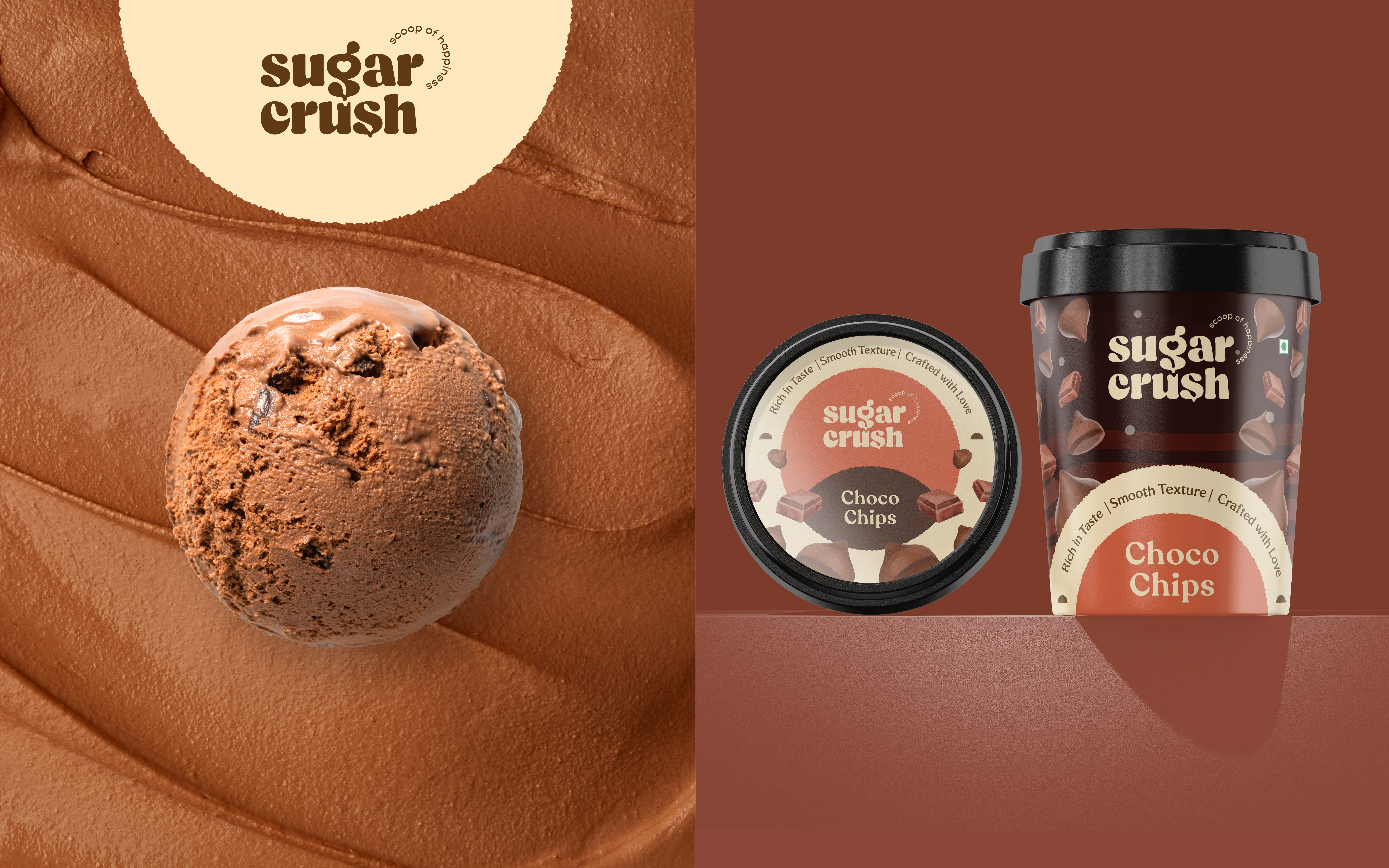
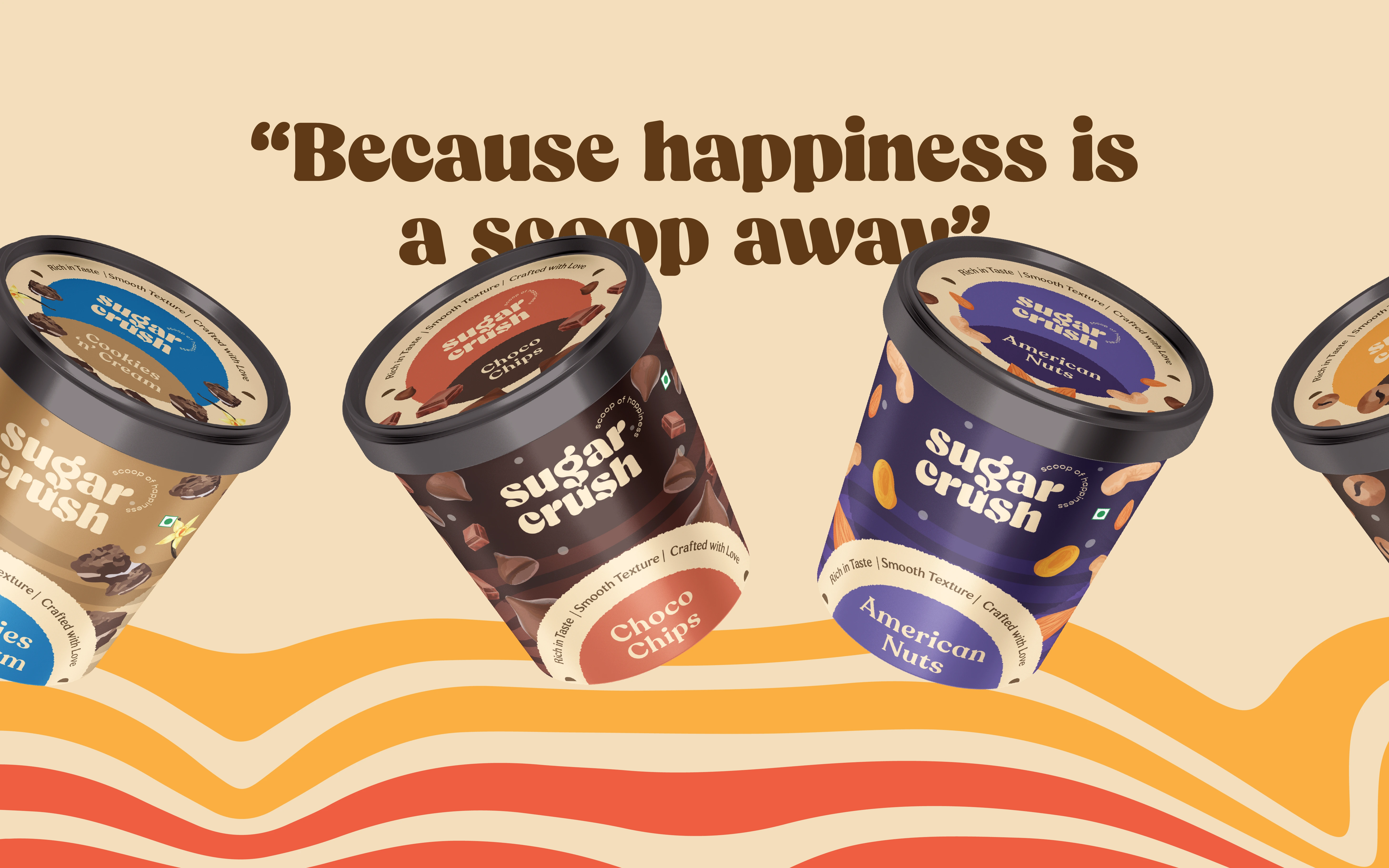
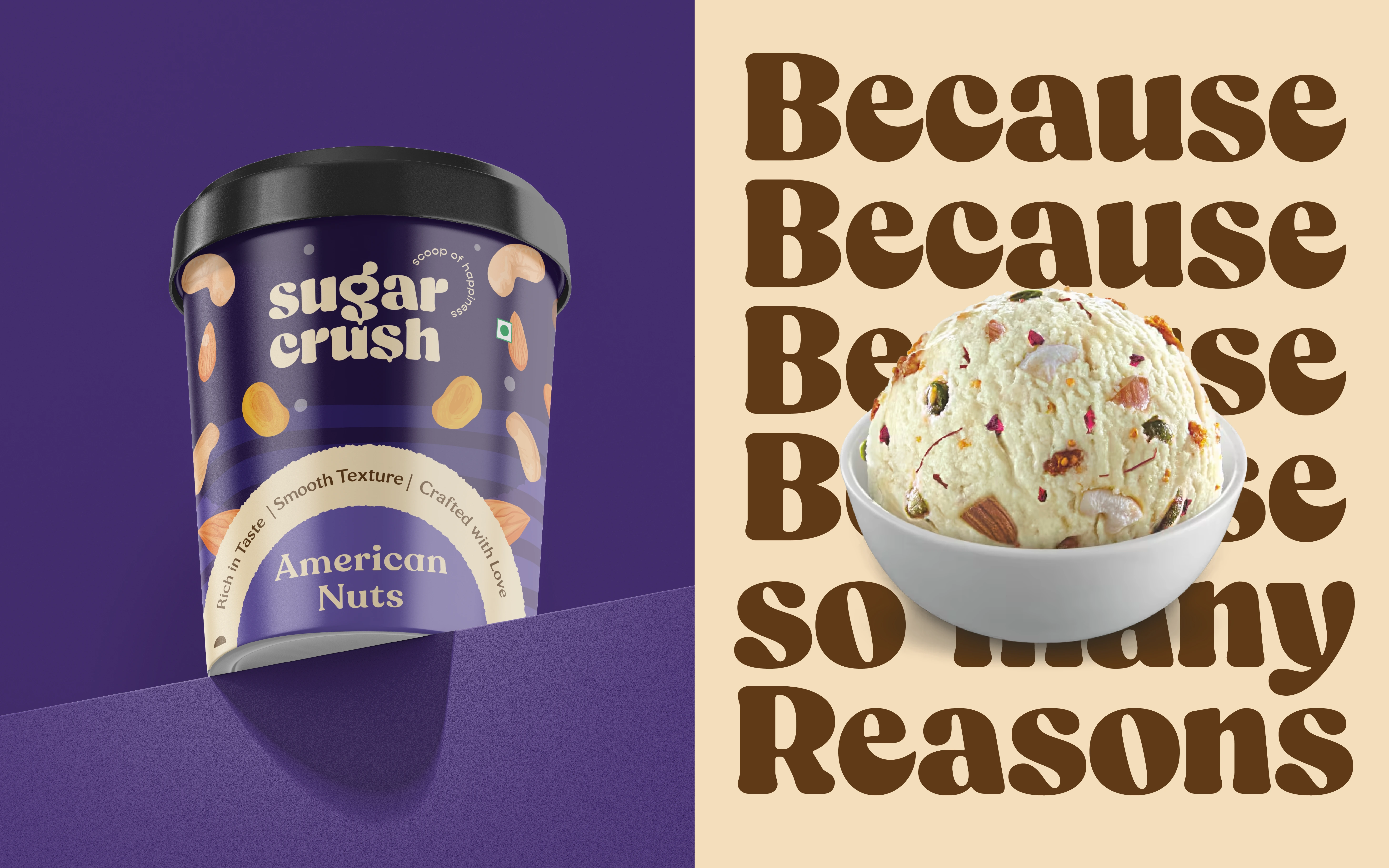
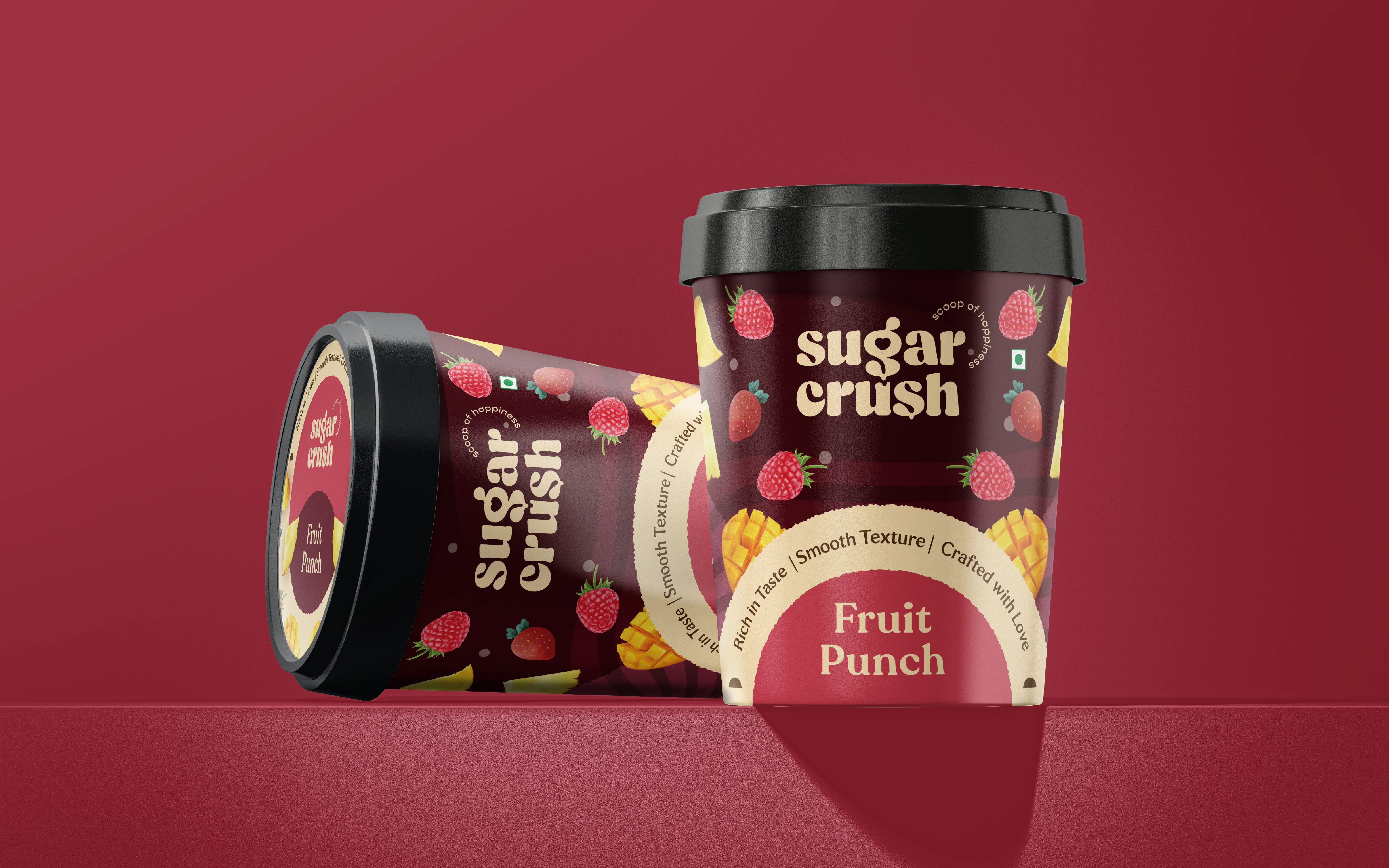
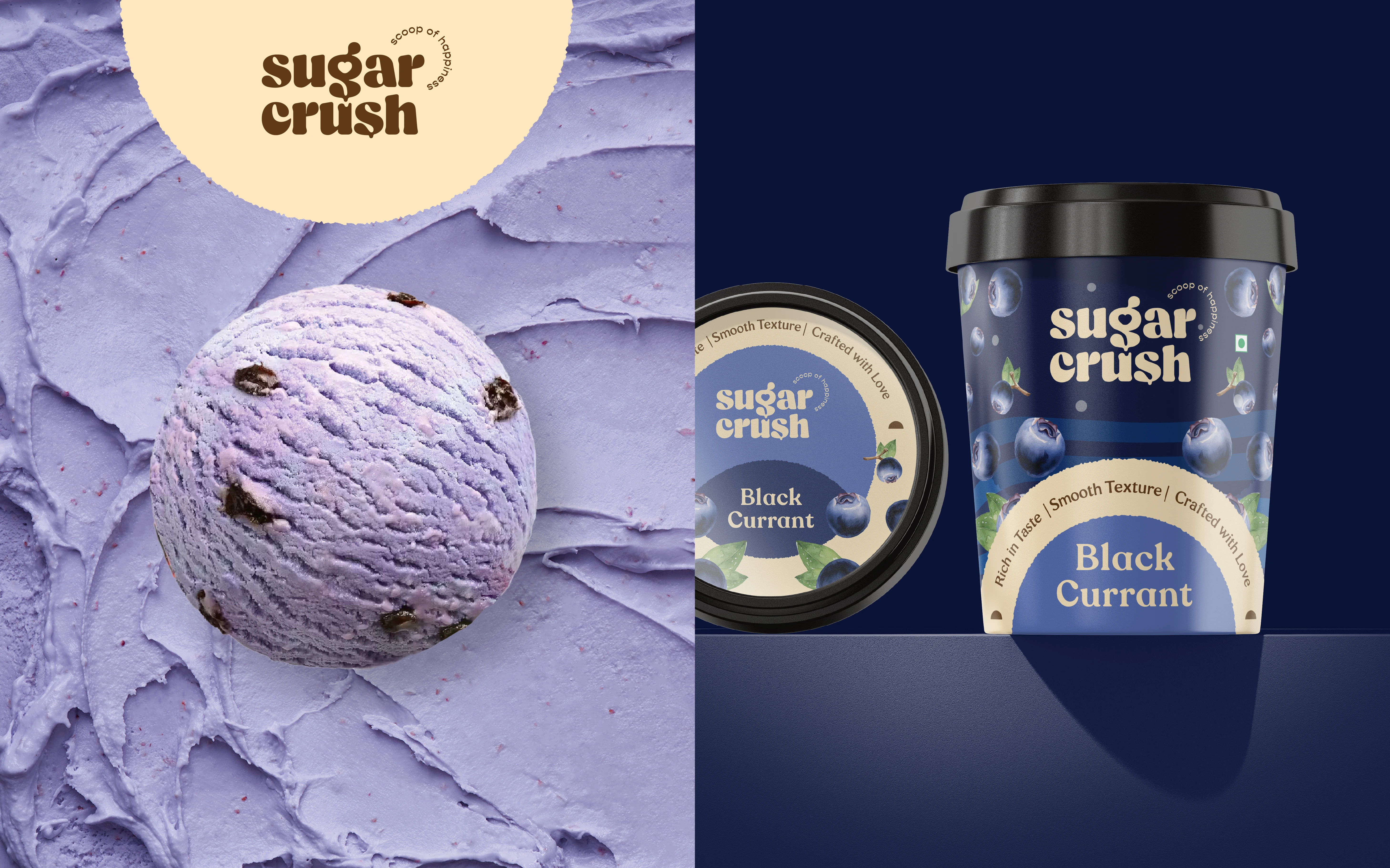
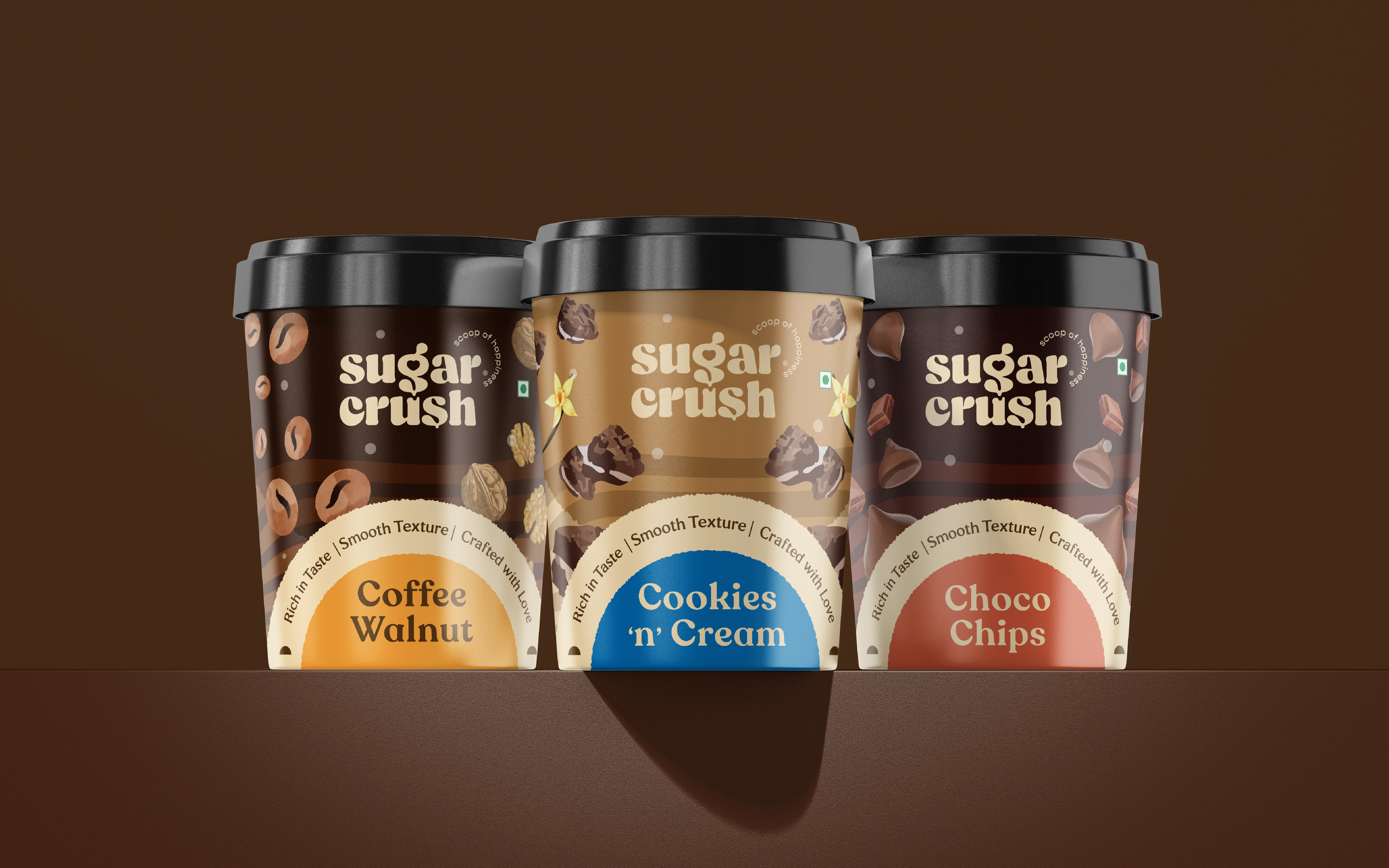
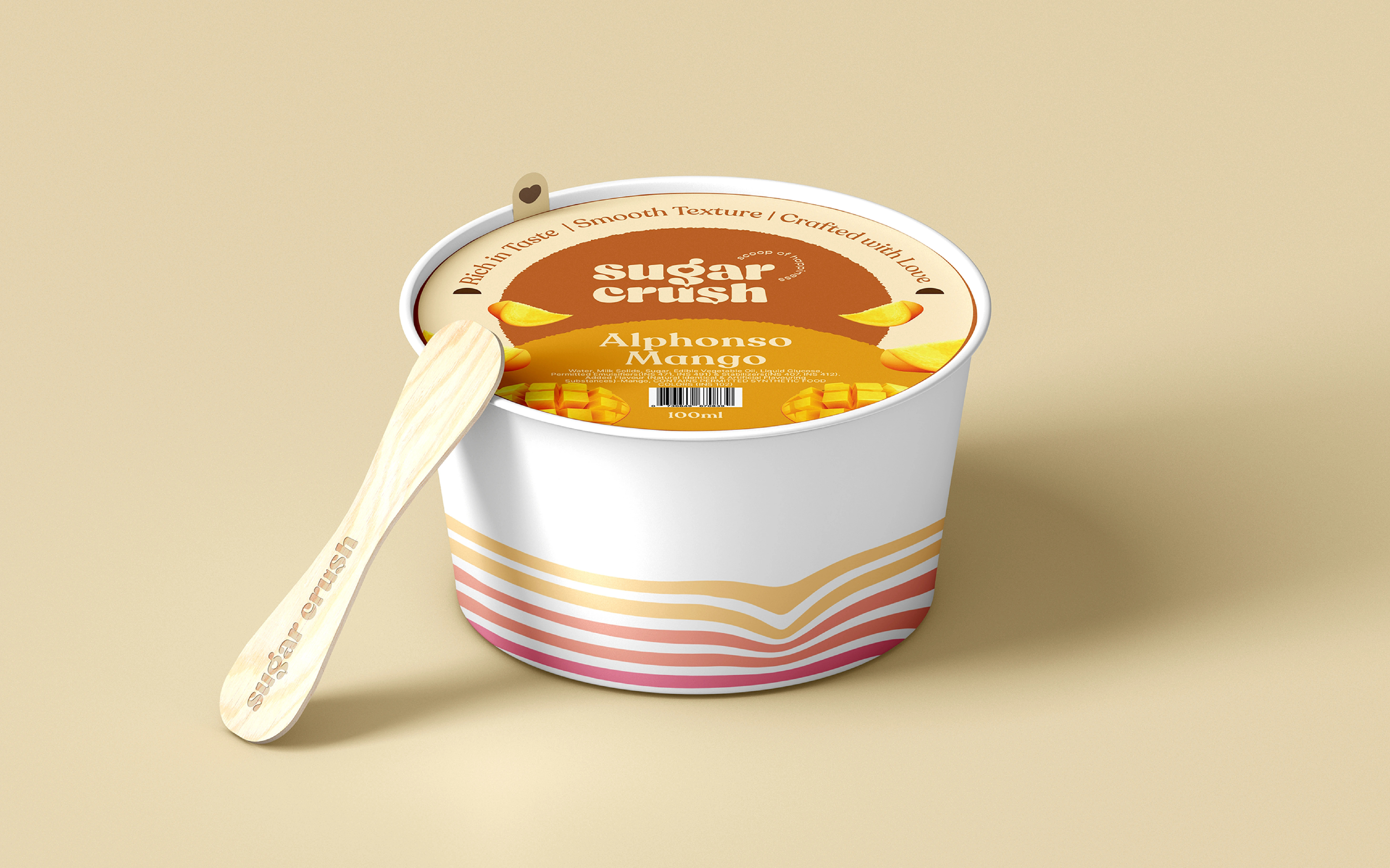
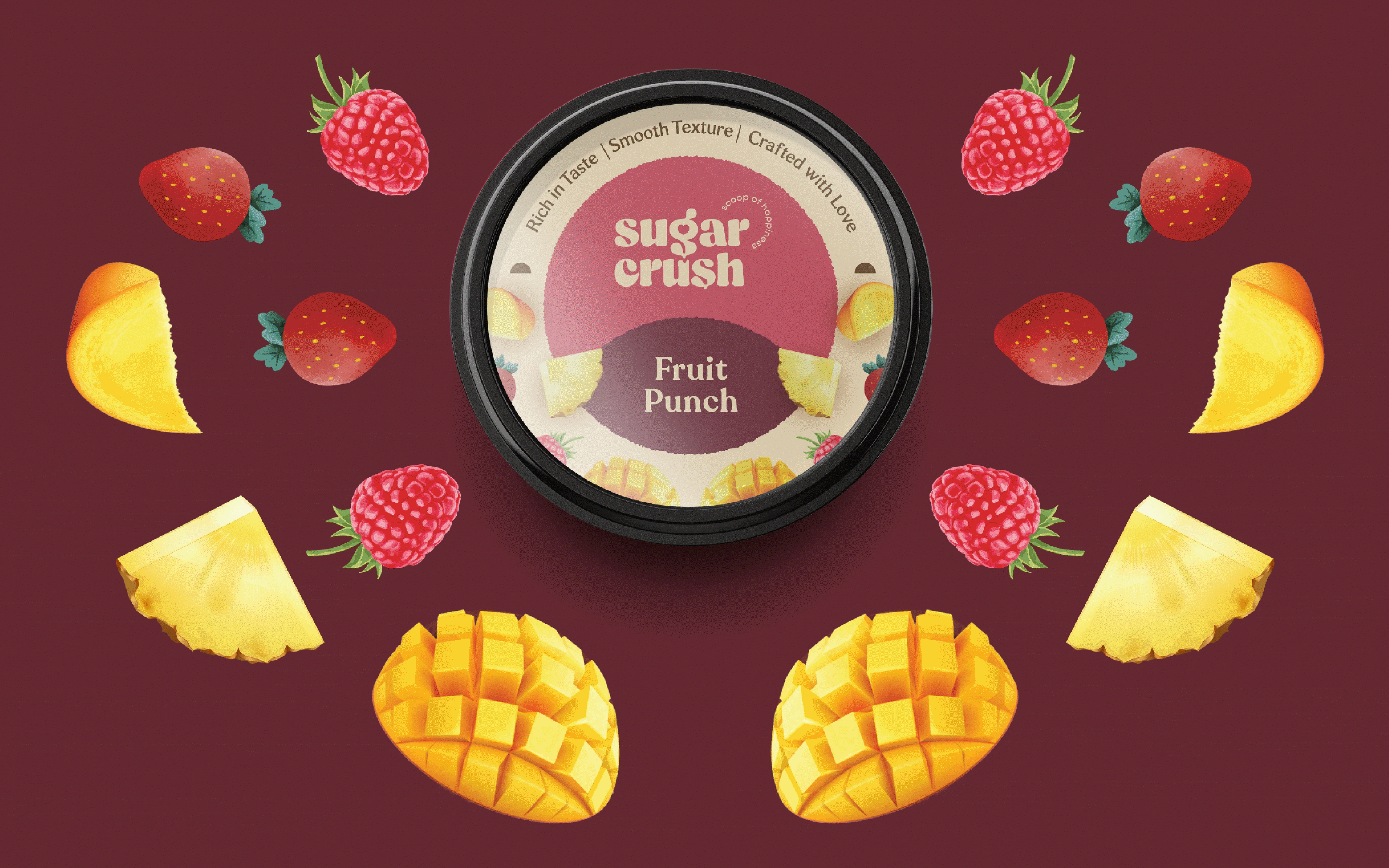
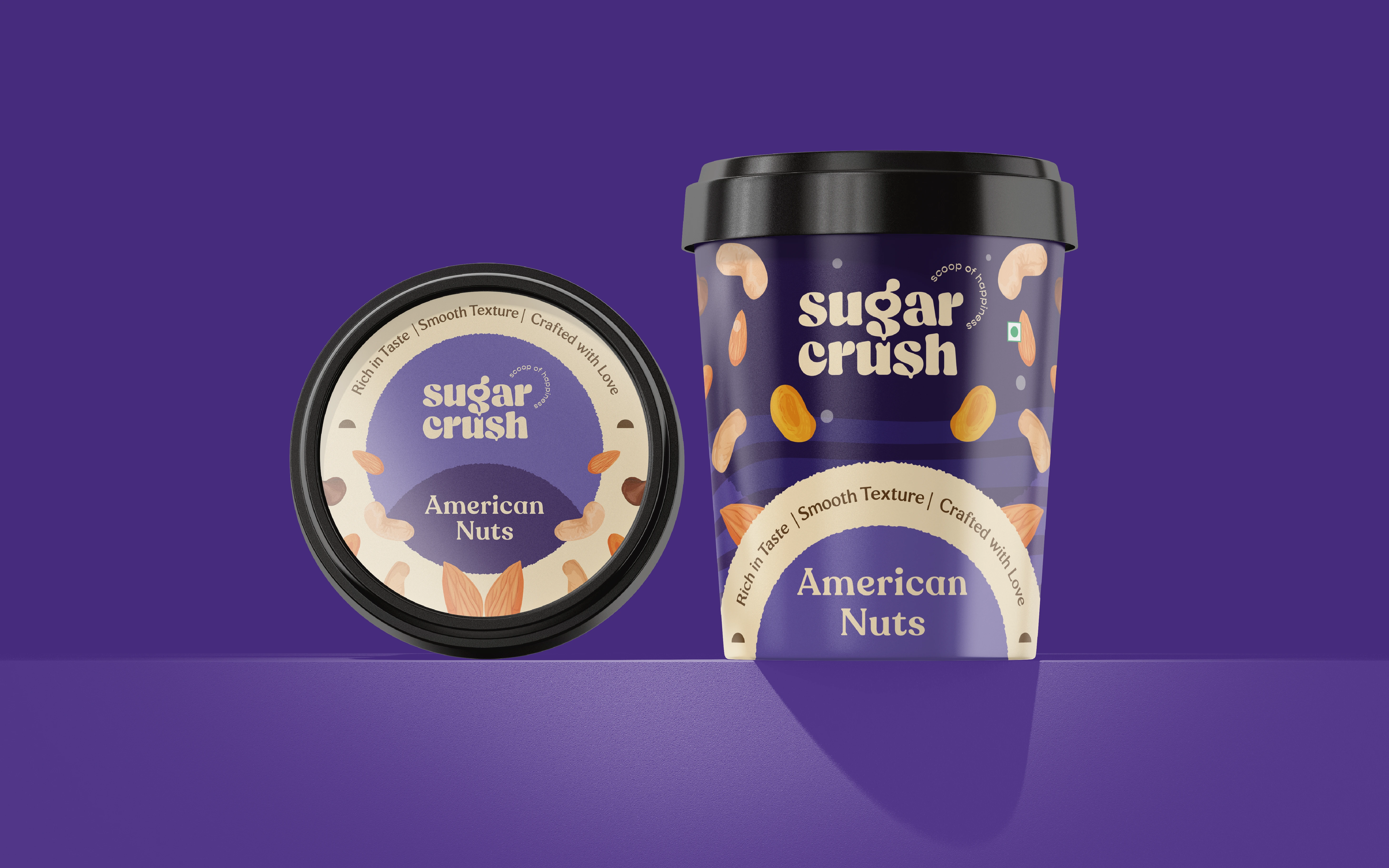
Packaging that stands out in the market by showing ‘No Scoops’
We highlighted ingredients with expressive illustrations, replacing conventional ice cream scoops with vibrant, ingredient-focused packaging. This bold design ensures clear flavour differentiation, reflecting the brand’s personality and creating a memorable consumer experience.
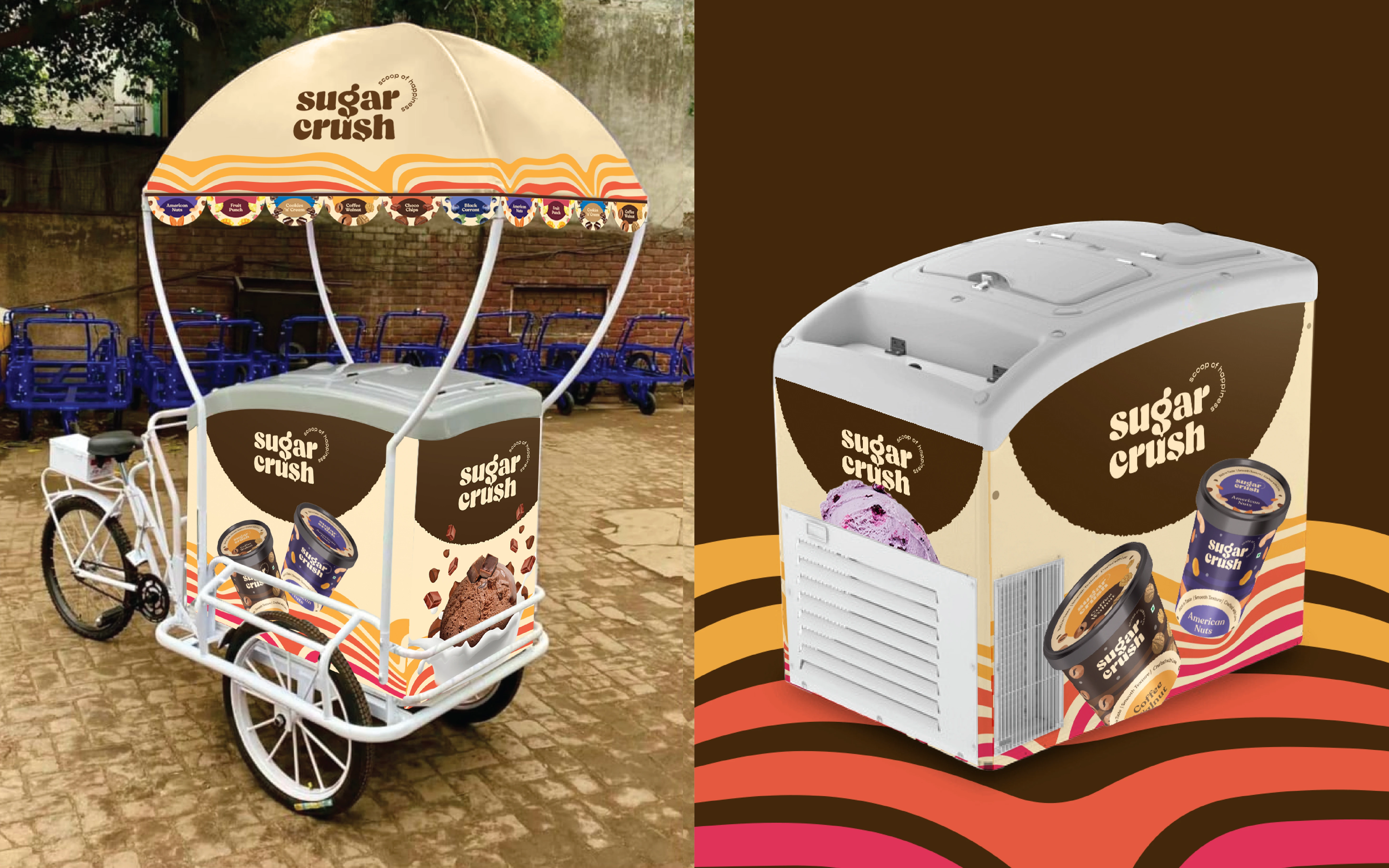
We went a step further by choosing an unconventional colour scheme for the cart, ensuring it grabs attention even on the busiest of streets.