HydrateMax is an emerging nutraceutical company. Forget the notion that hydration is only for when you're thirsty or hitting the gym. HydrateMax believes in a different perspective - hydration is a conscious choice, an essential part of your wellness routine, just like exercise and healthy eating. We're not about pushing limits or prescribing rigid regimens. We're about caring and empowering you to elevate your well-being through the simple yet powerful act of optimal hydration.
Services: Brand Identity | Packaging
Sector: FMCG | Nutraceuticals
Challenge:
How can a nutraceutical company position hydration products in a crowded market of dominant brands?
Solution:
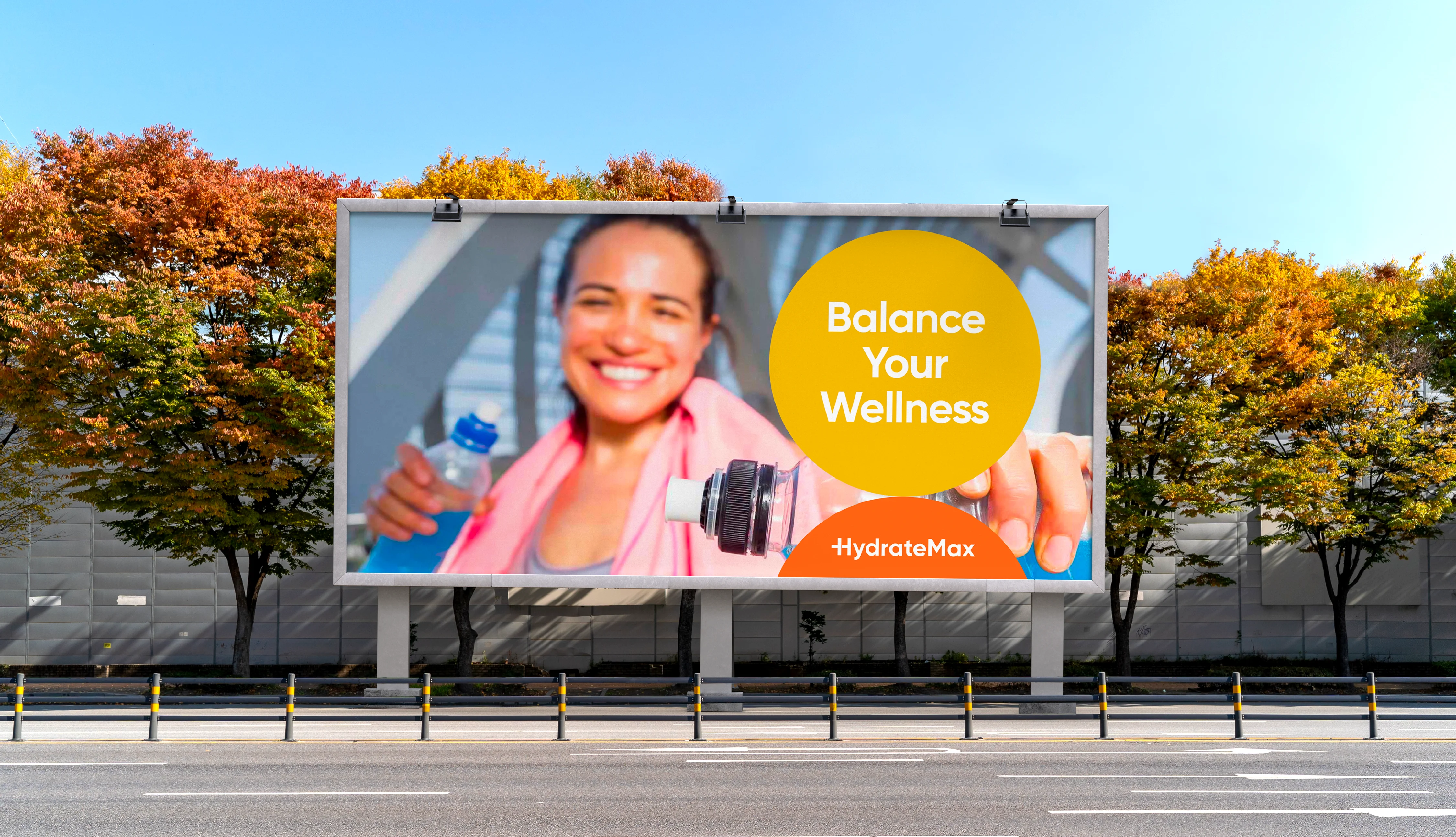
Reframe hydration as a form of self-care, empowering you to balance your wellness and unlock peak potential.
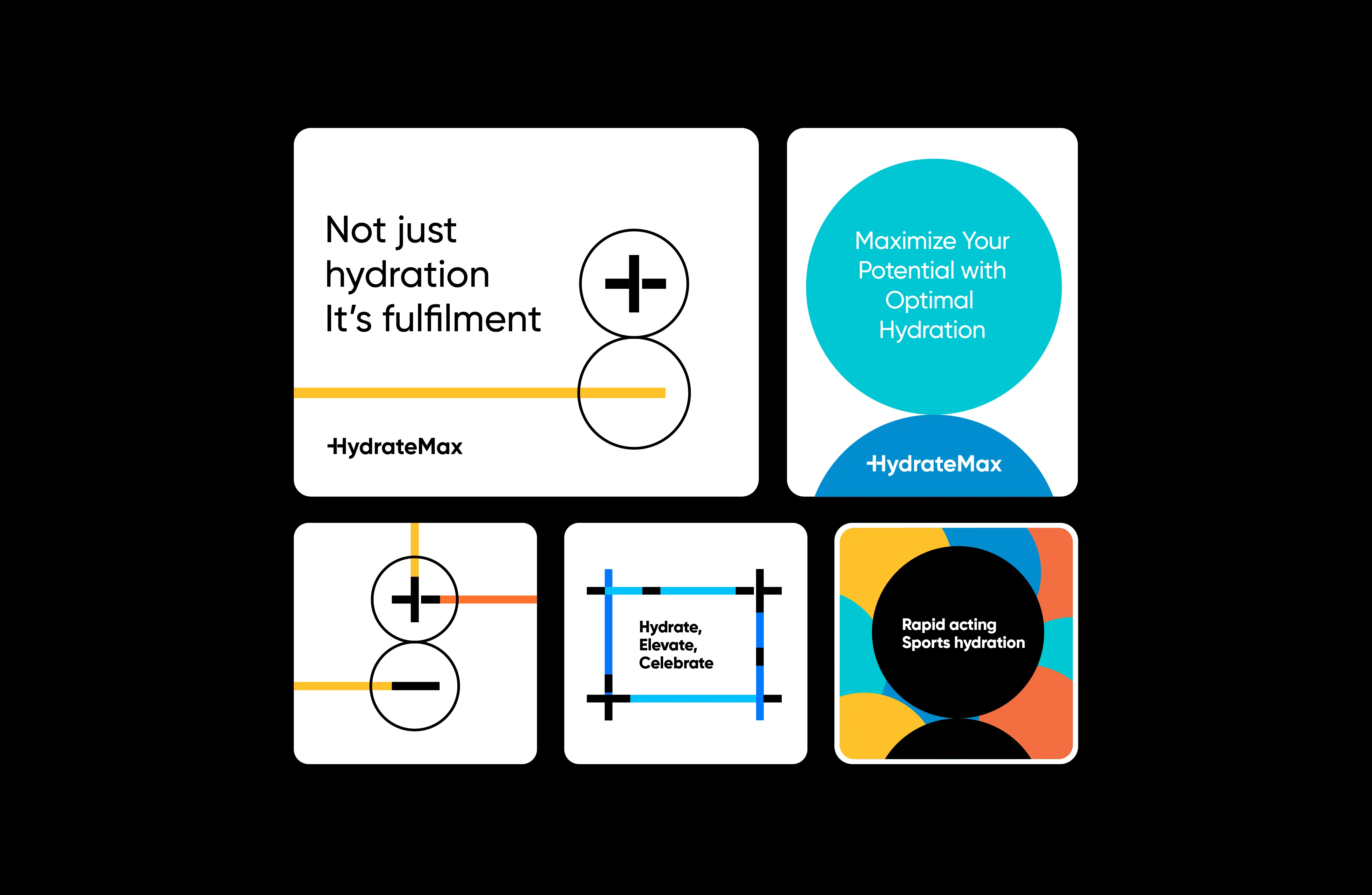
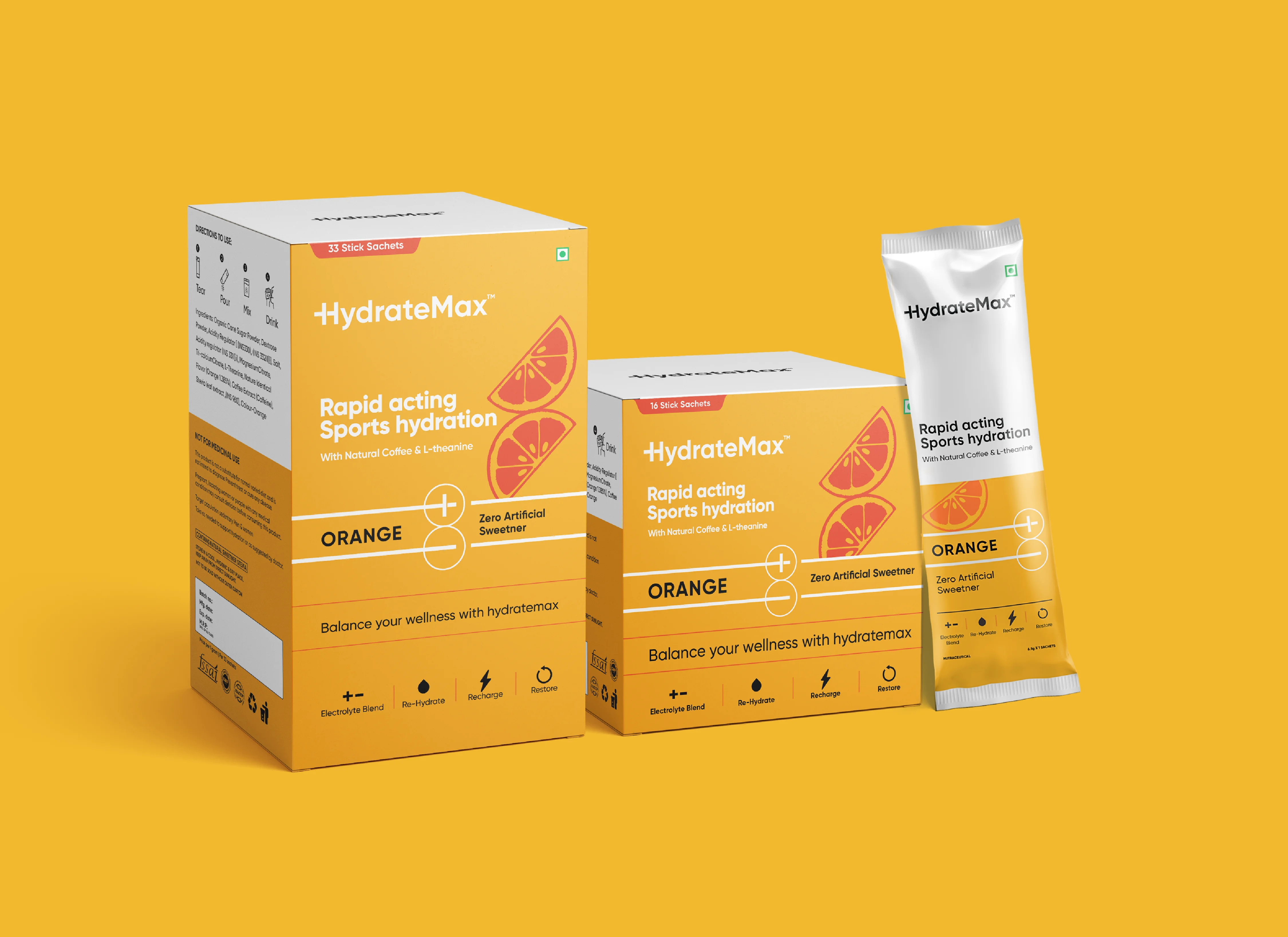
Using ‘Charge’ of Electrolytes to Summarise the Brand Message
We crafted a Wordmark Logo that cleverly integrates the positive and negative charge within the letter ‘h,’ symbolising the power of electrolytes. Using a clean, straightforward design, we created a logo that speaks for itself.
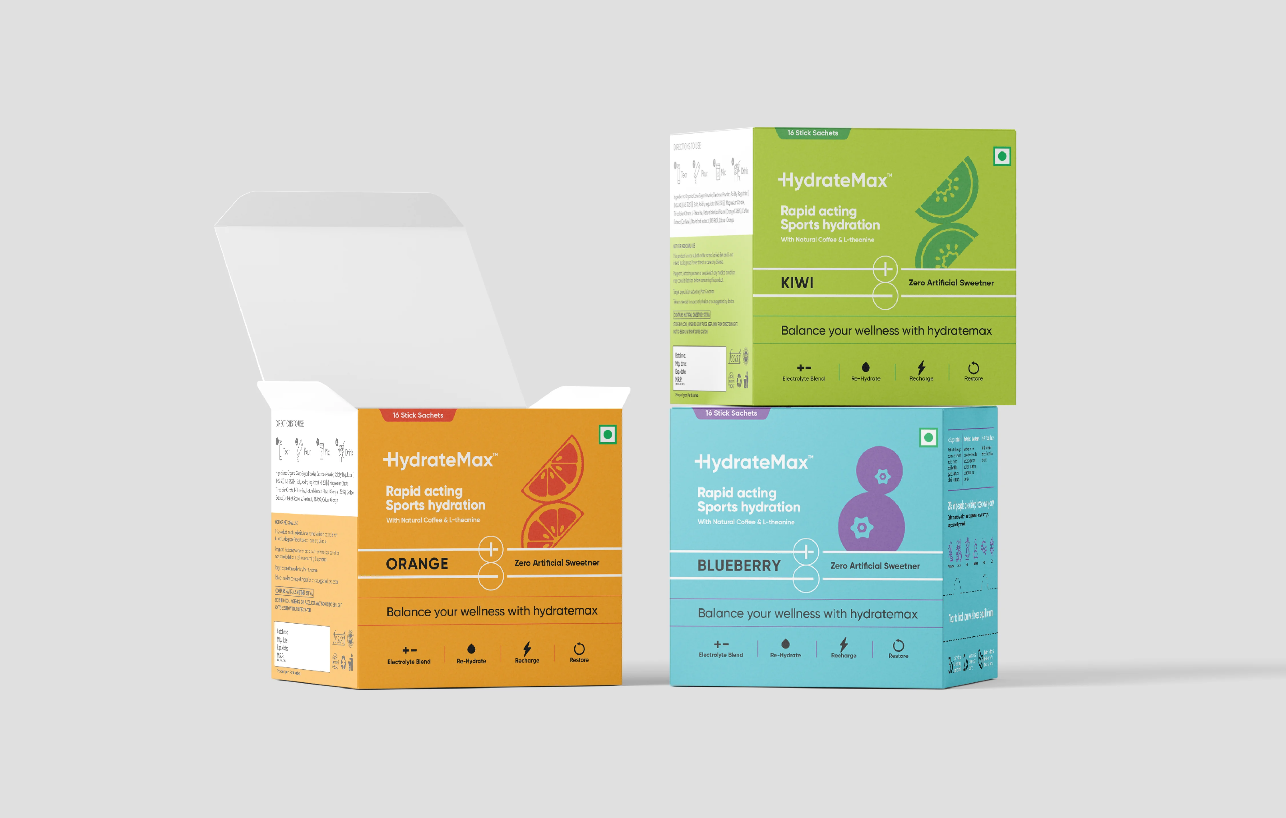
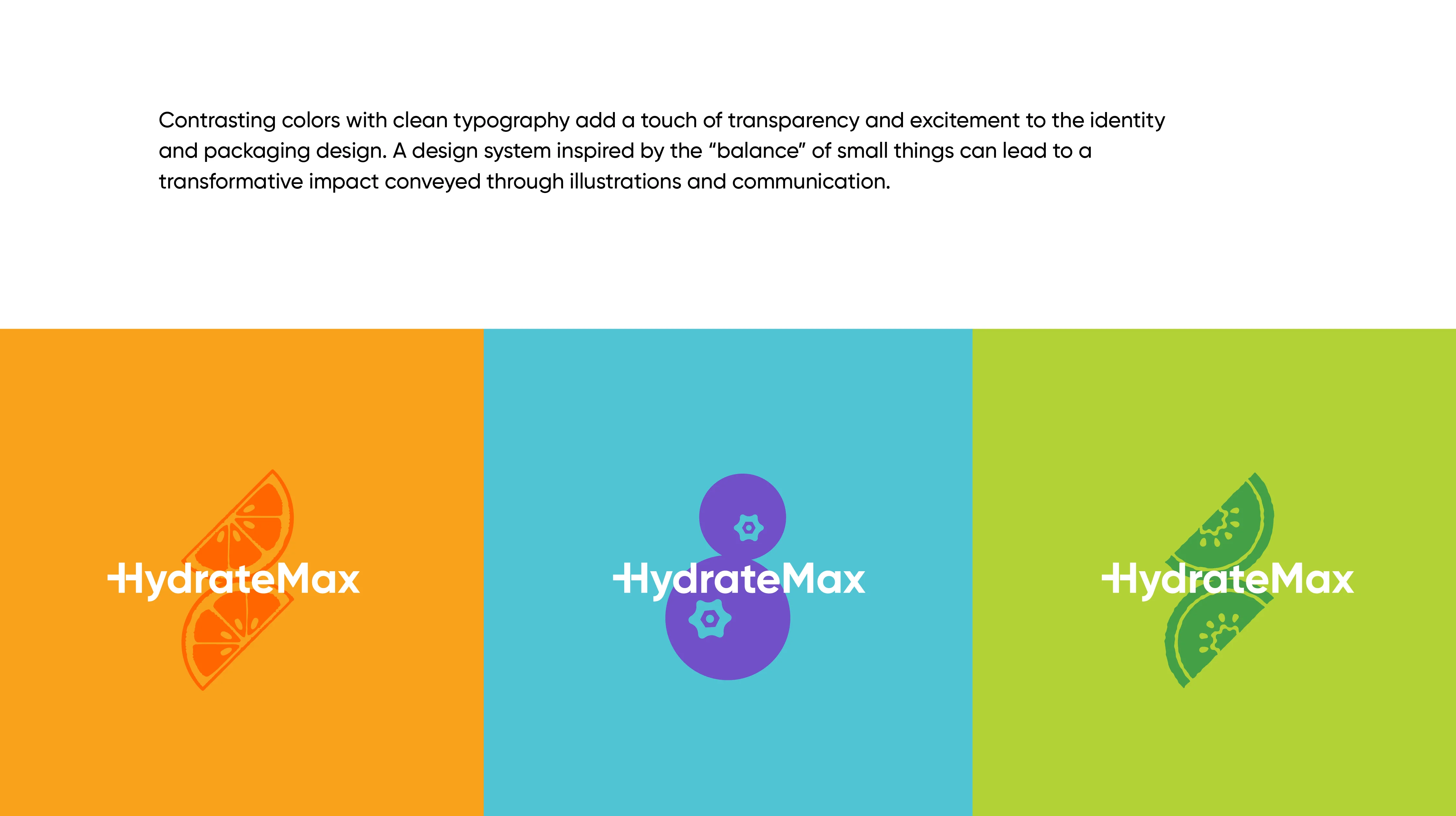
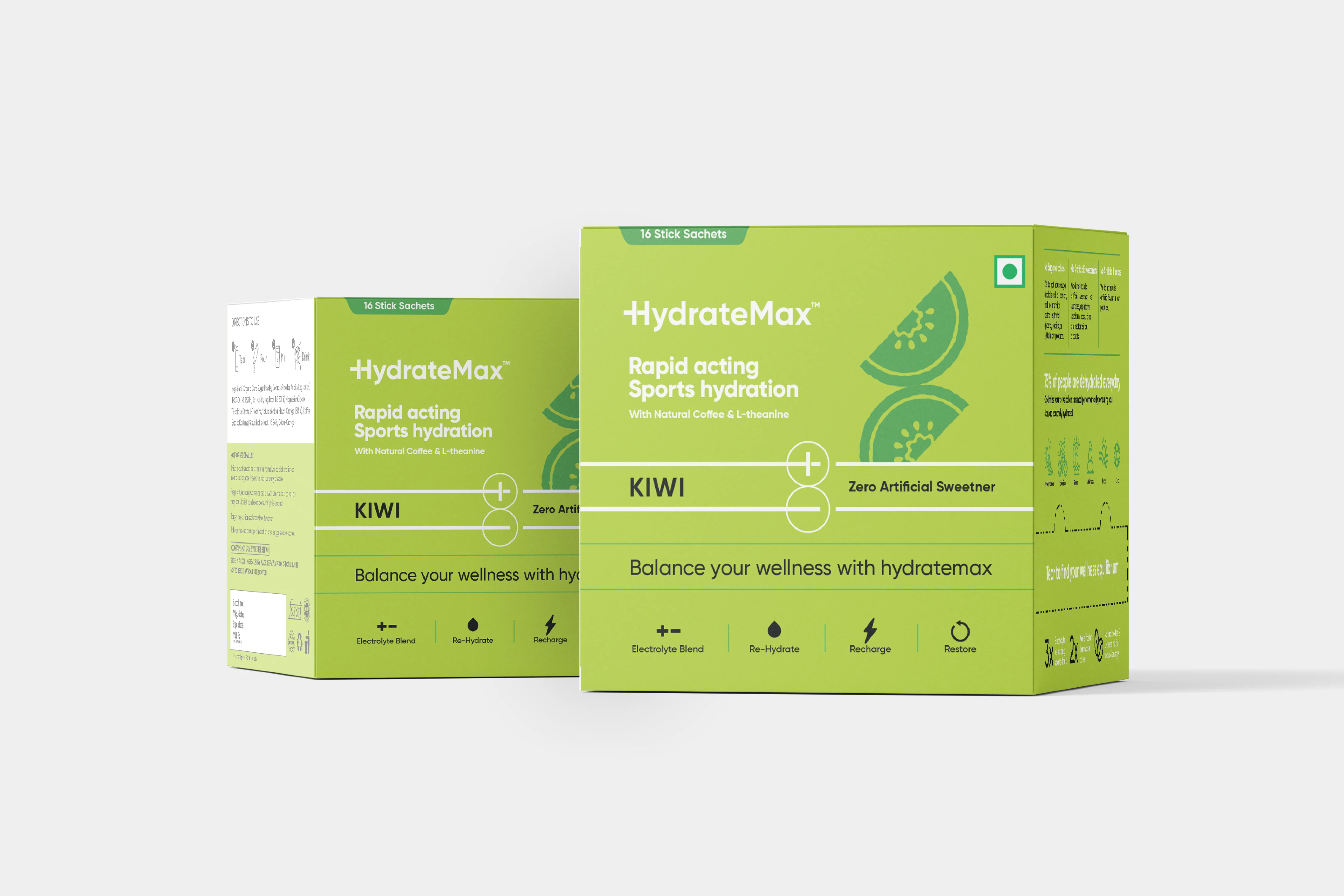
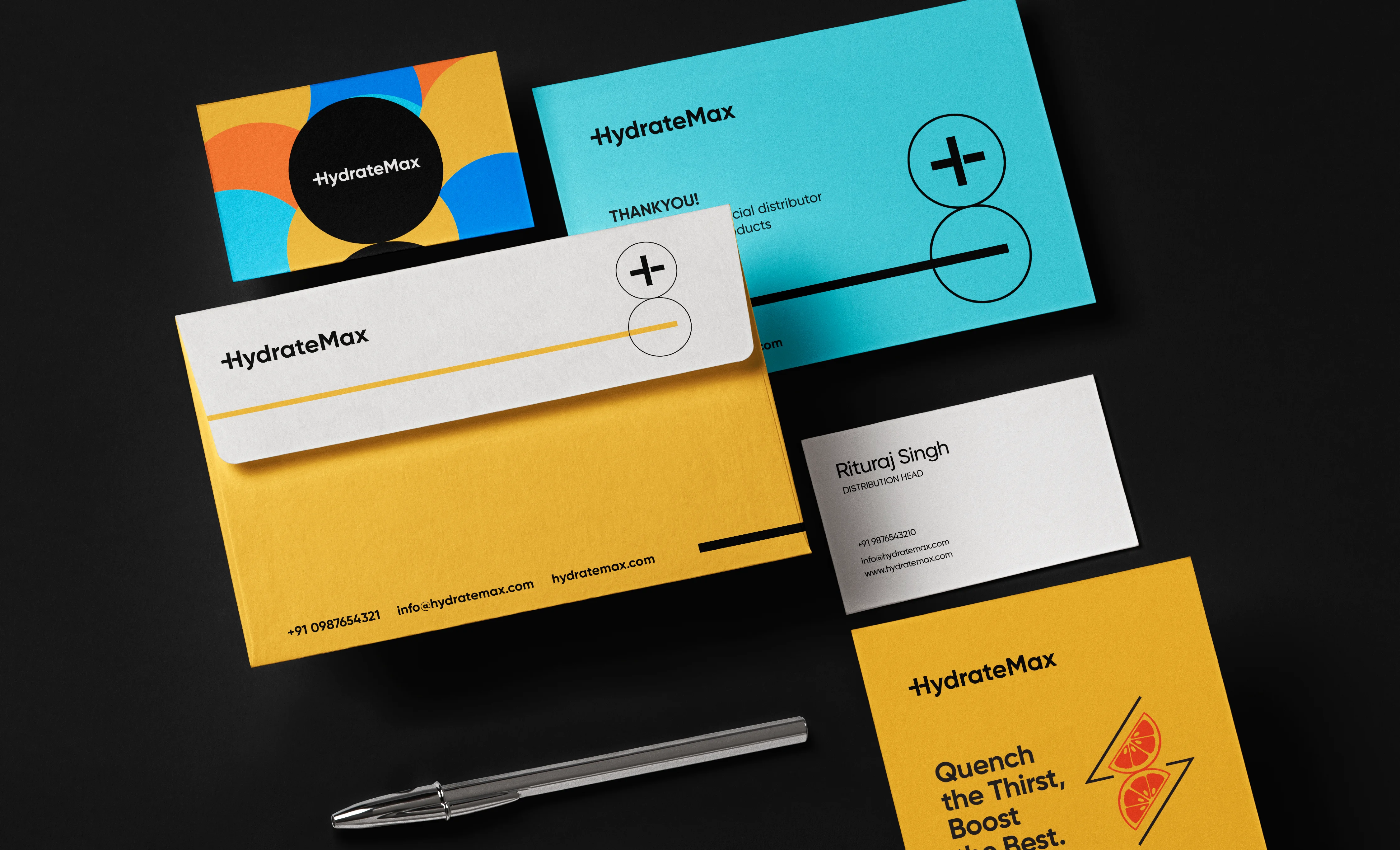
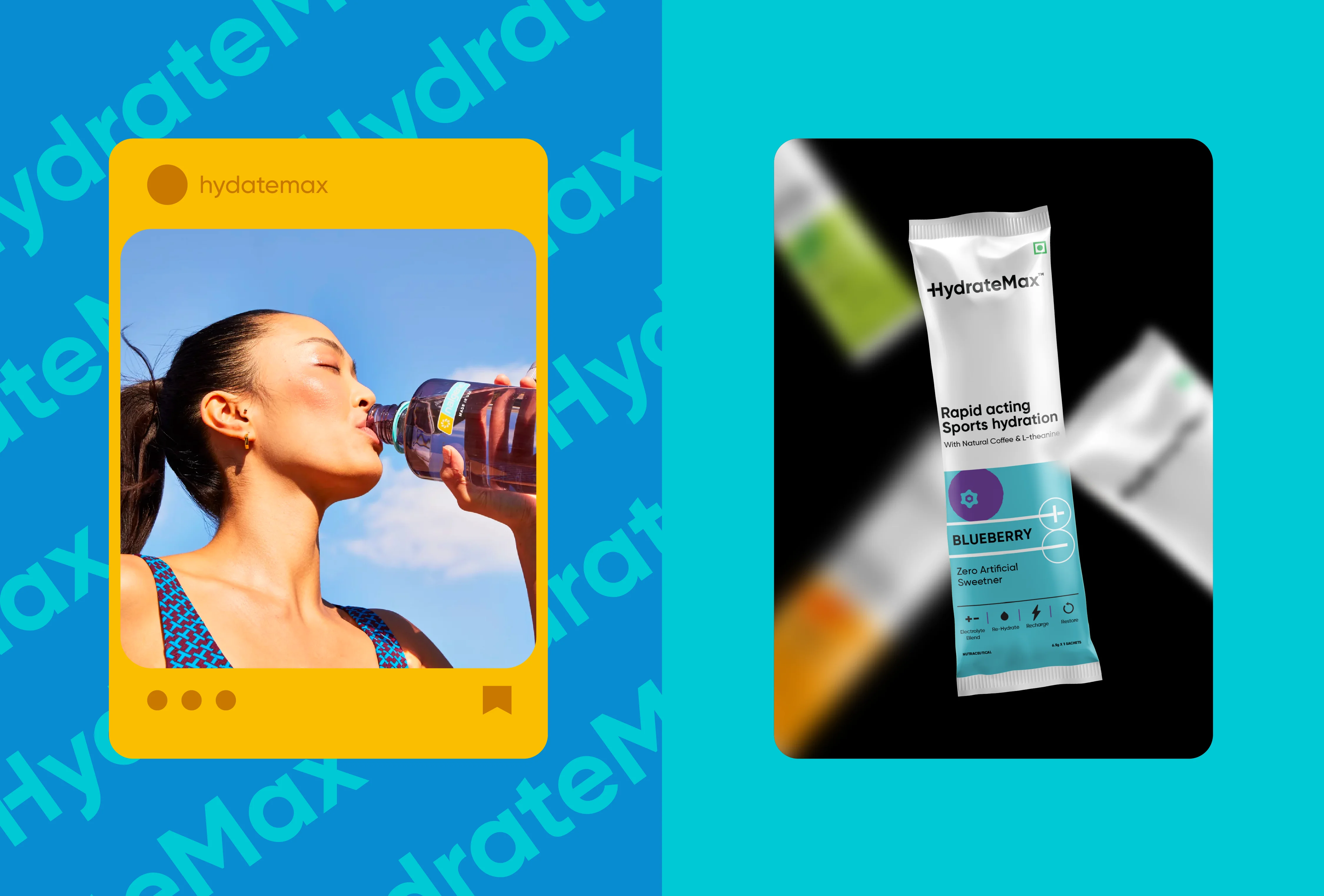
Brand Identity Inspired by ‘Importance of Balance’ in Human Life
We used contrasting colours and clean typography to bring energy and clarity to the identity and packaging design. By incorporating transparency and a sense of excitement, we created a design system centred on ‘balance’. Even the illustrations of flavours like orange and lemon are layered to visually represent ‘how important balance is in life’.