Established in 1987, Miraj Group is a renowned business conglomerate with a diverse portfolio spanning Movie Theatres, FMCG, Pipes & Fittings, Stationery, and more. Their latest venture brings ready-to-eat home-style meals to the table. Their unique offering? Delicious, homely food cooked fresh, packaged with care and preserved with modern packaging technology. These meals stay fresh for over a year, delivering the comfort of home anytime, anywhere.
Services: Brand Identity | Packaging
Sector: FMCG
Challenge:
How do you confidently showcase ‘Homely Meals’ crafted with the precision of modern technology?
Solution:
By combining vibrant branding and packaging with food beautifully presented in traditional Indian pots.
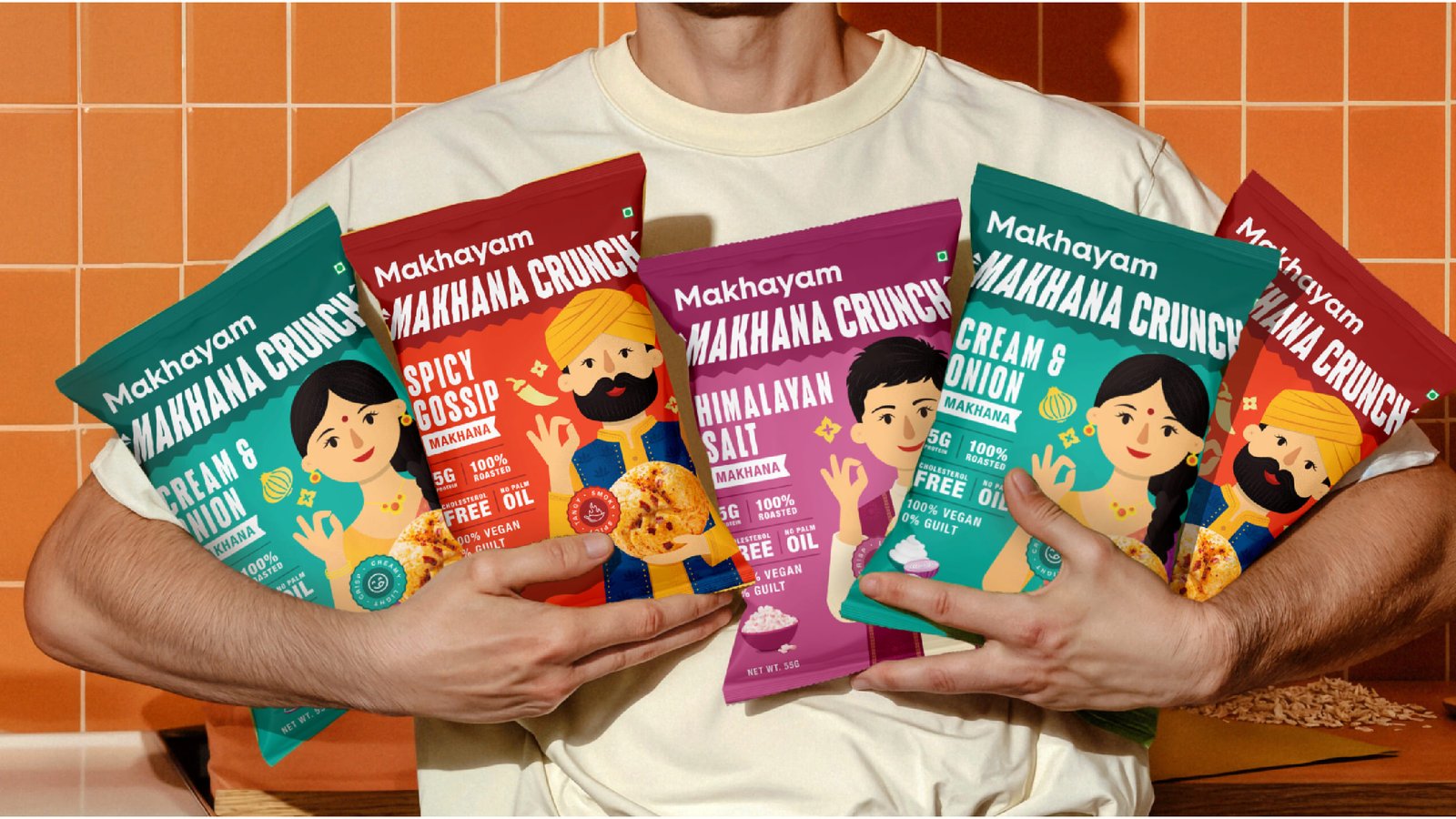
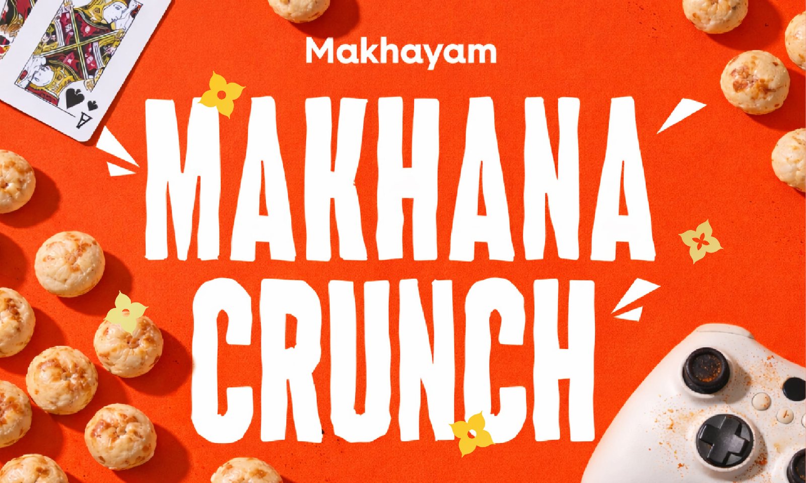
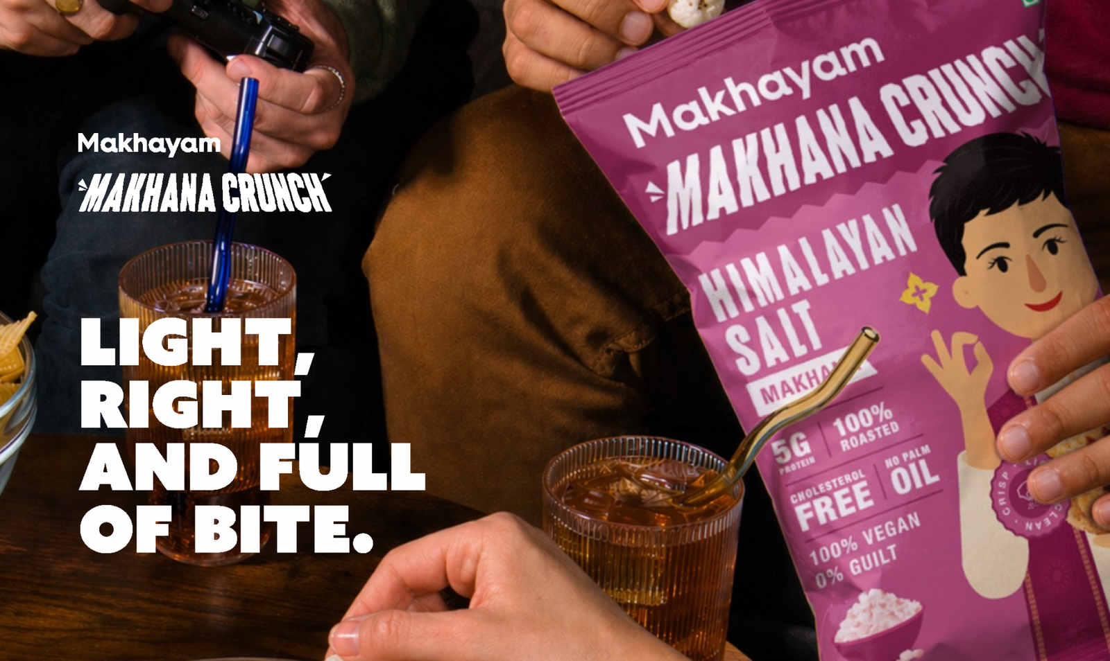
Rethinking Makhana through India’s flavorful snacking culture.
Instead of positioning Makhana as just another healthy product, we decided to bridge the gap between India’s rich snacking culture and modern healthy consumption. The strategy focused on transforming the perception of Makhana from a functional ingredient into a flavorful and memorable snacking experience.
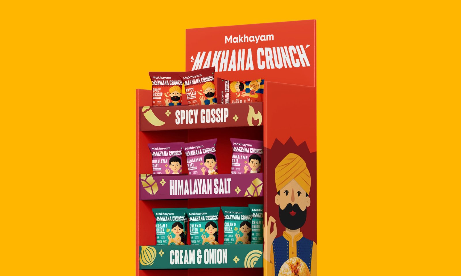
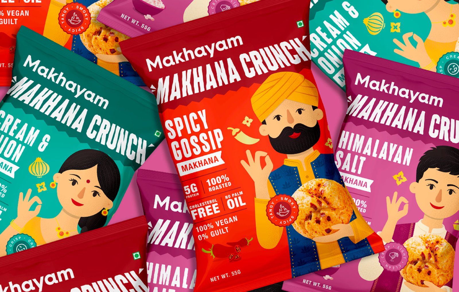
Naming Strategy
“Makhana” rooted the brand in the category,
while “Crunch” shifted the perception from ingredient to snacking experience.
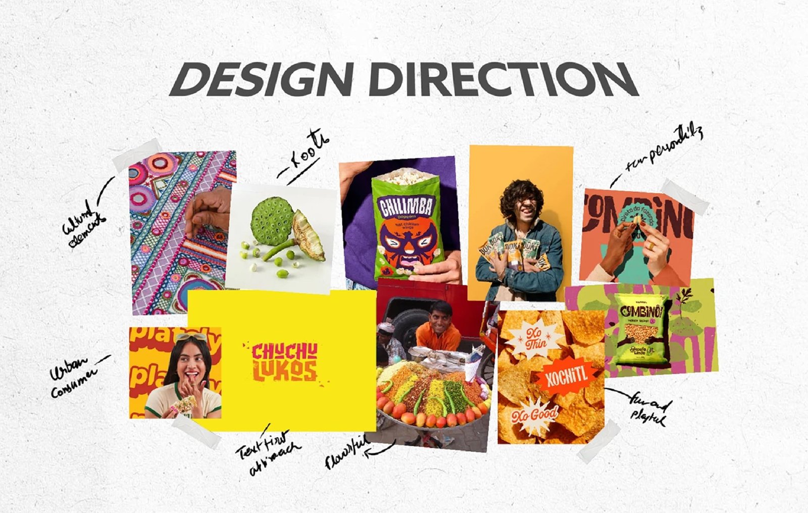
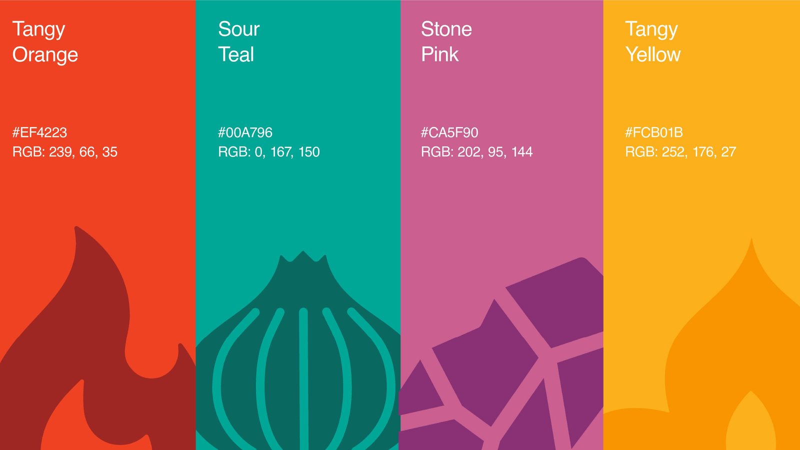
The visual identity moved away from the typical clinical health aesthetic commonly seen in the category. Instead, we introduced a vibrant and playful design system inspired by India’s diverse snacking culture. Bold colors, expressive typography, culturally rooted illustrations, and premium detailing helped the brand feel energetic and modern while still maintaining familiarity and authenticity.
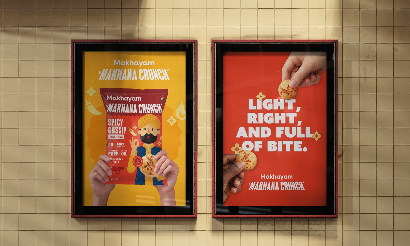
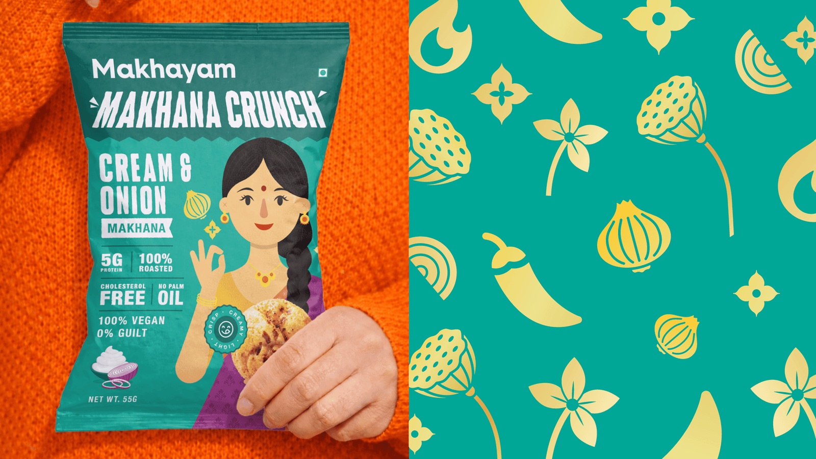
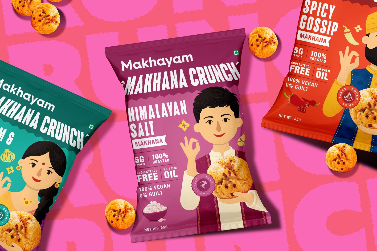
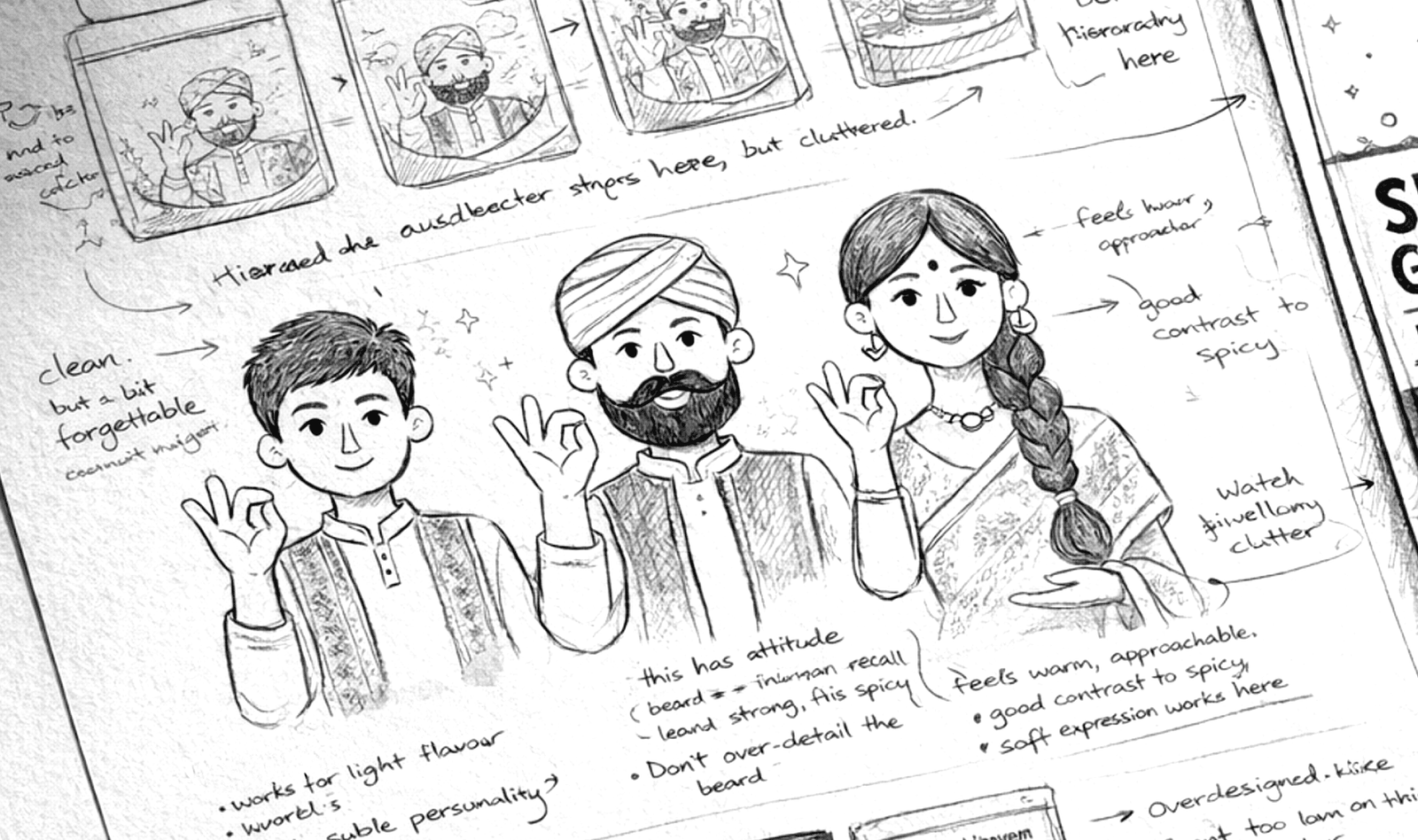
Each flavor was treated as a distinct personality rather than just a variant. To create stronger memorability and emotional connection, we developed custom characters inspired by different Indian identities and cultural references. Spicy Gossip featured a Punjabi-inspired character, Himalayan Salt drew inspiration from Himalayan attire and textile patterns, while Sour Cream incorporated traditional Indian styling through saree-inspired detailing. These elements helped every flavor feel expressive, rooted, and uniquely recognizable on the shelf.
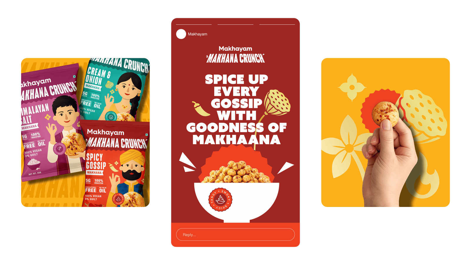
Makhyam Crunch was built for young urban consumers who are reconnecting with their roots while still seeking modern and flavorful experiences. By combining cultural familiarity with playful storytelling and strong shelf presence, the brand creates a clearer reason for consumers to notice, remember, and try the product in an increasingly competitive snacking category.
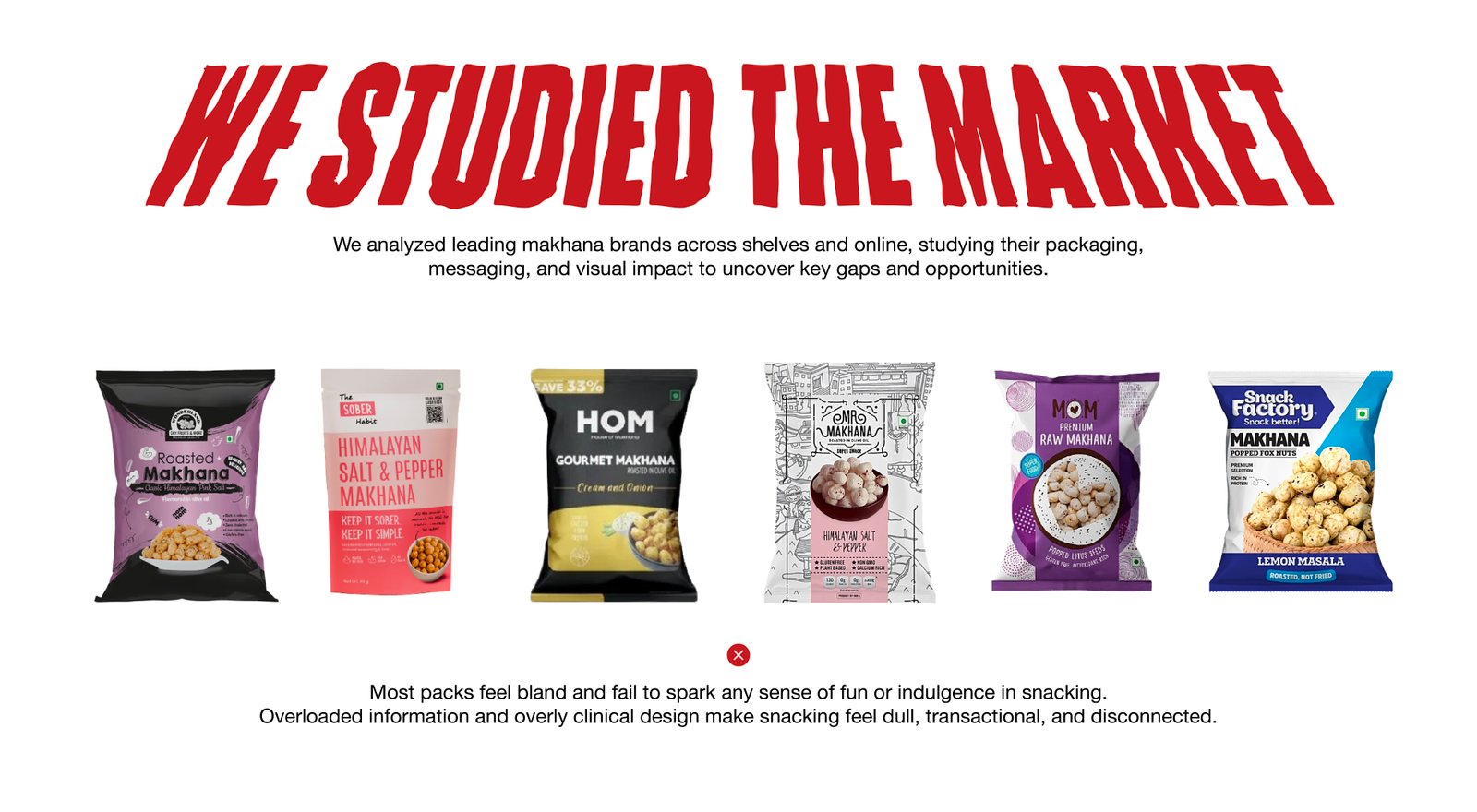
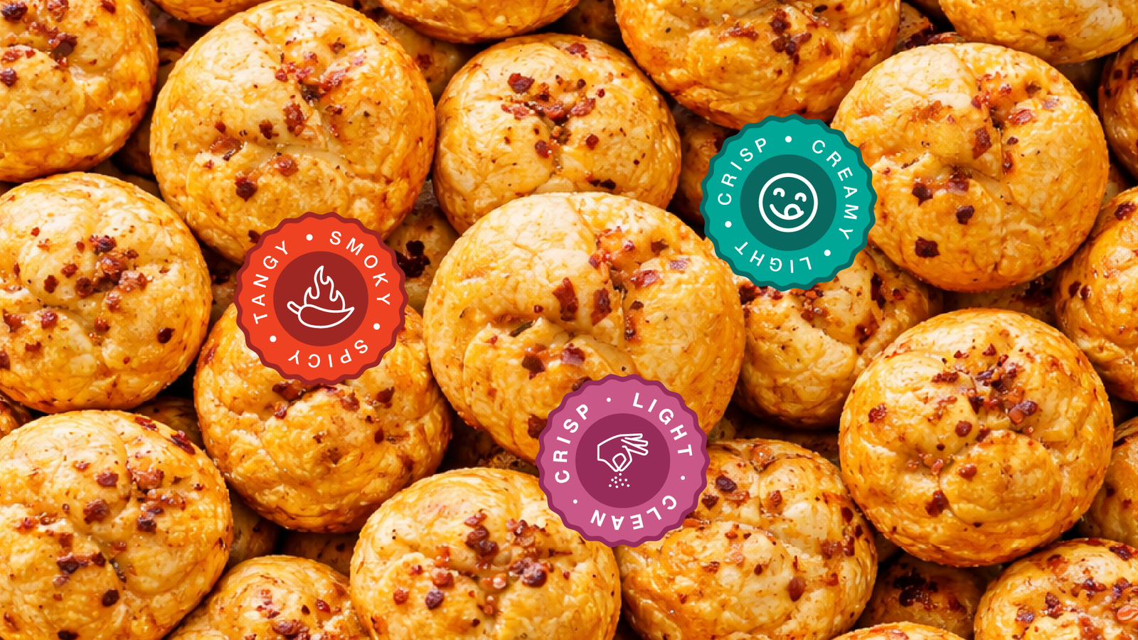
While flavor became the primary entry point for the brand, health communication was still carefully integrated into the packaging system. Nutritional information and product benefits were balanced with bold illustrations and vibrant storytelling to ensure the packaging remained informative without appearing overly clinical.