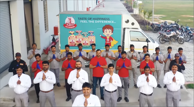
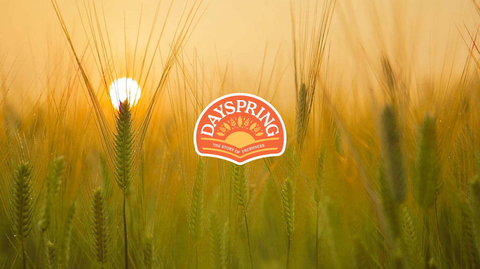
Dayspring, a renowned brand from the city of Nawabs—Lucknow, produces bread with zero human touch. By sourcing grains from local farmers and utilising cutting-edge technology, Dayspring ensures large-scale production without human intervention. The name ‘Dayspring’ translates to ‘the beginning of a new day,’ symbolising the start of something fresh and remarkable.
Services: Brand Identity | Packaging | Tagline
Sector: FMCG
Challenge:
How do you revamp a traditional brand and position yourself as the strongest player in a cluttered market?
Solution:
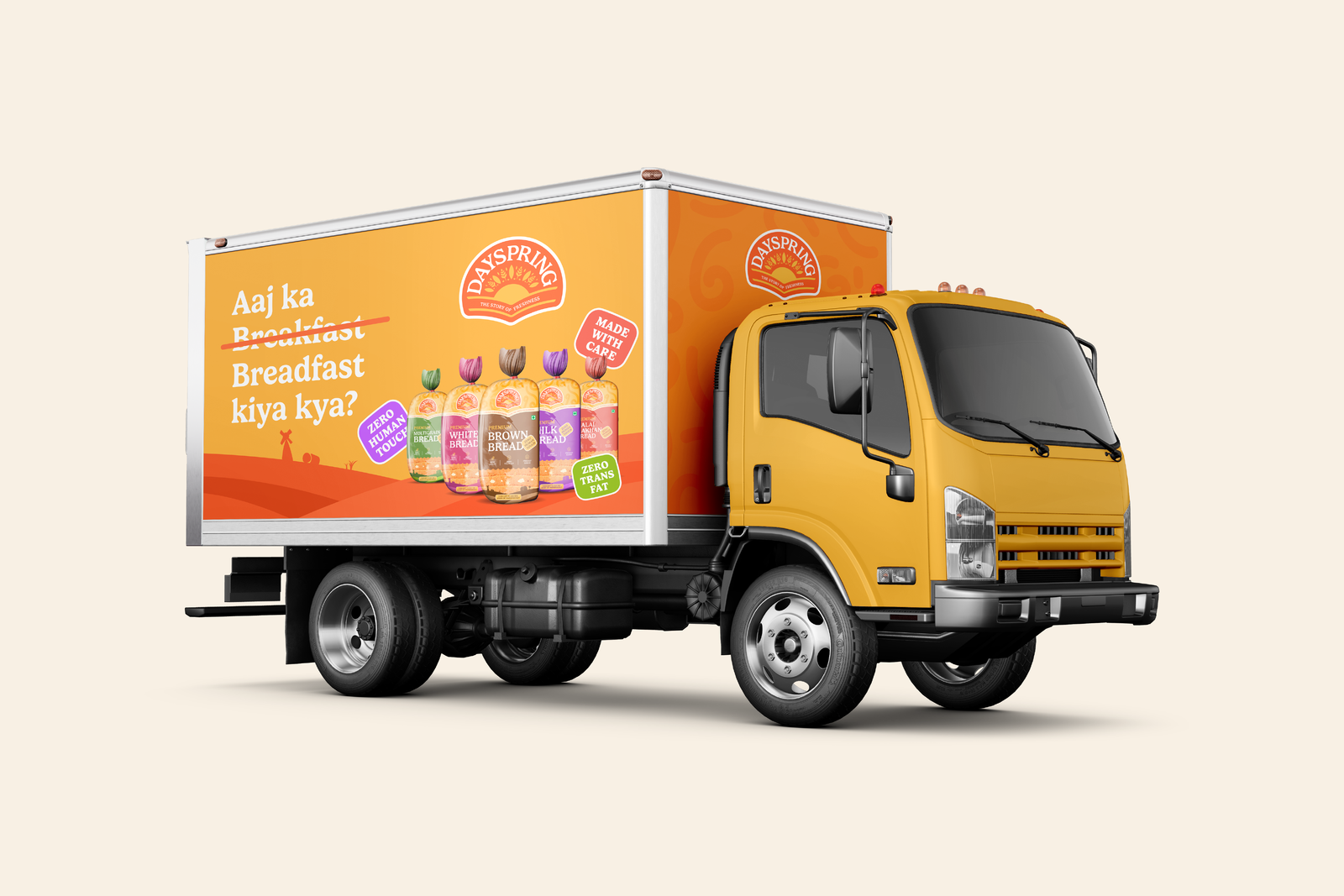
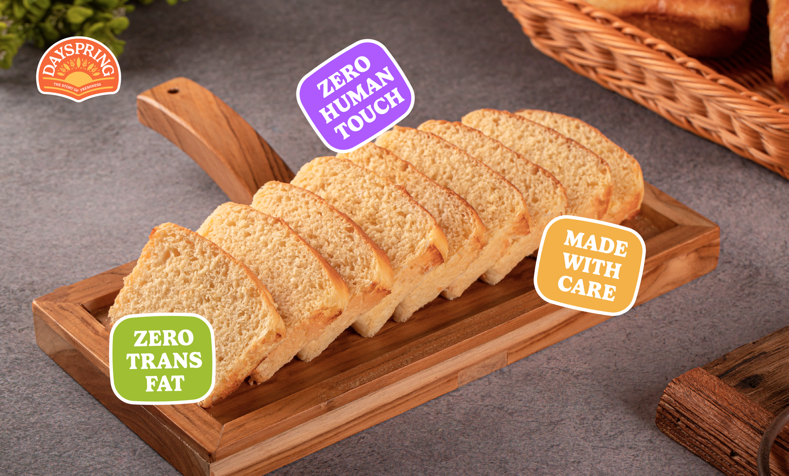
By highlighting the USP of the product (Made with Zero Human Touch) incorporated with the traditional values of the brand.
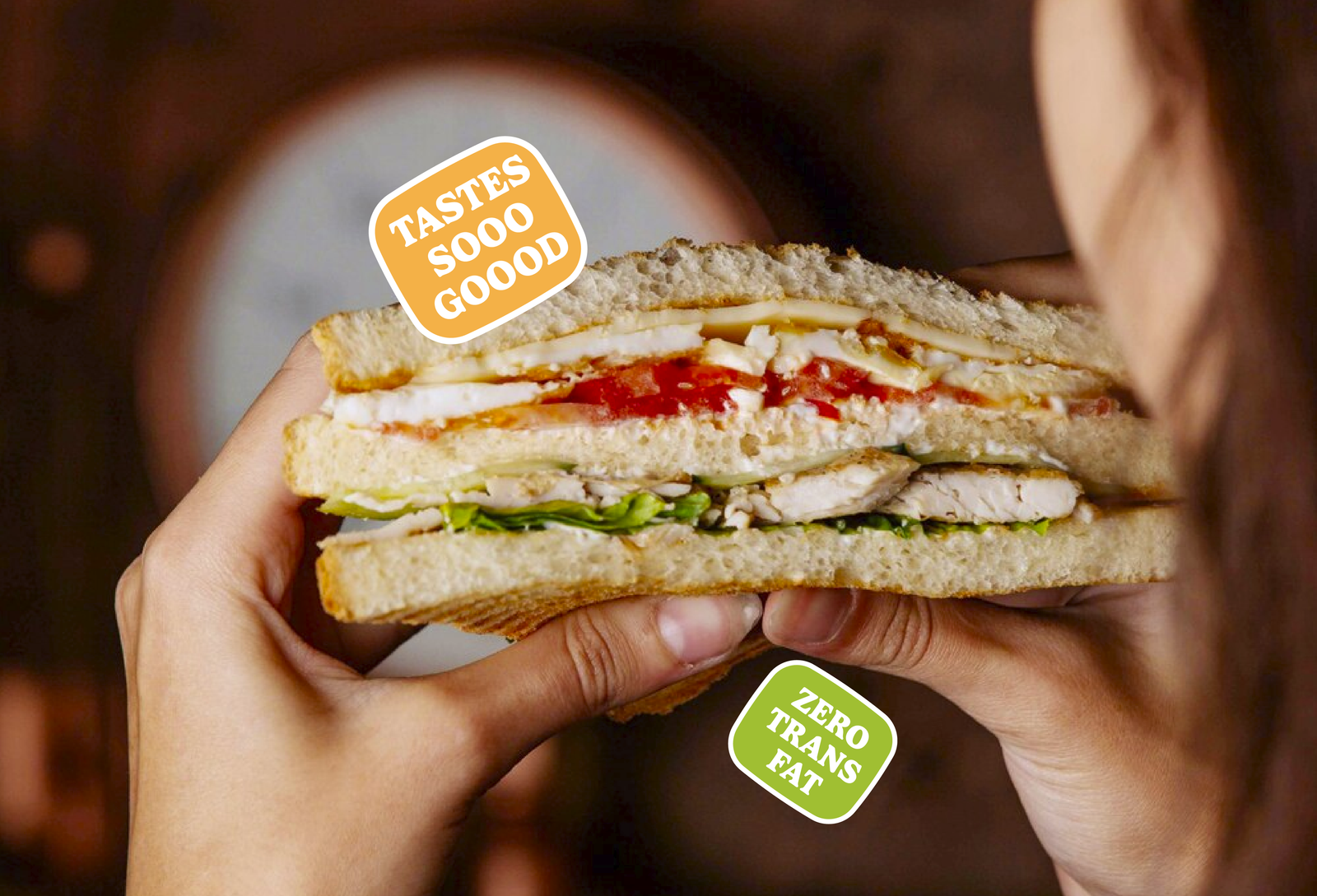
We Conducted a Thorough Survey to Understand the Market Demand
We began our research with a survey to explore customer behaviour around bread—when they consume it, how they use it, and what matters most when choosing a loaf. With over 250 responses, the insights were clear: freshness is the top priority for people when buying bread.
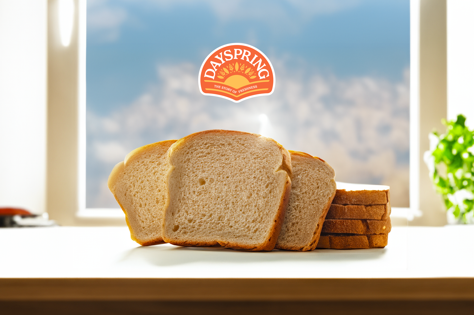
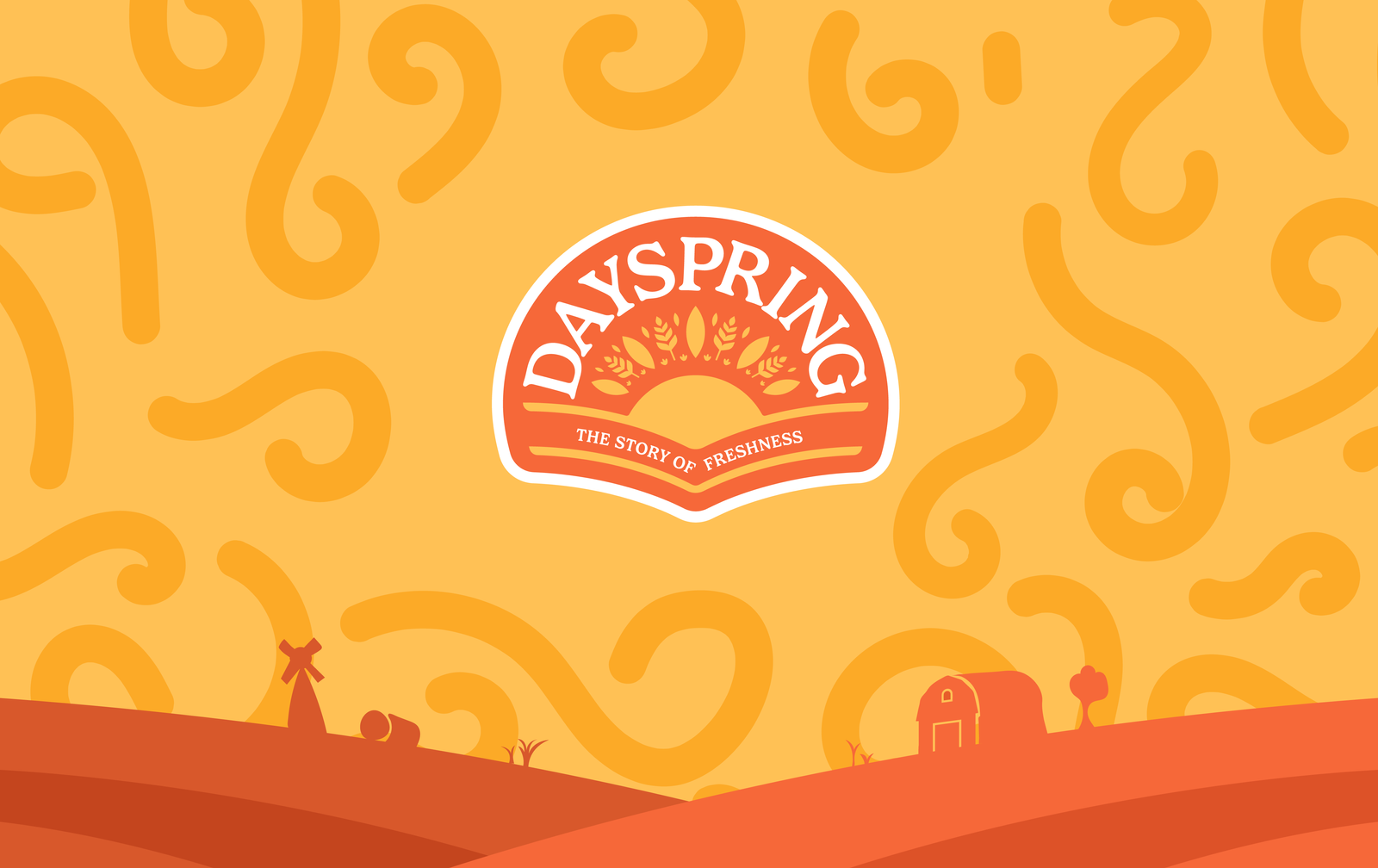
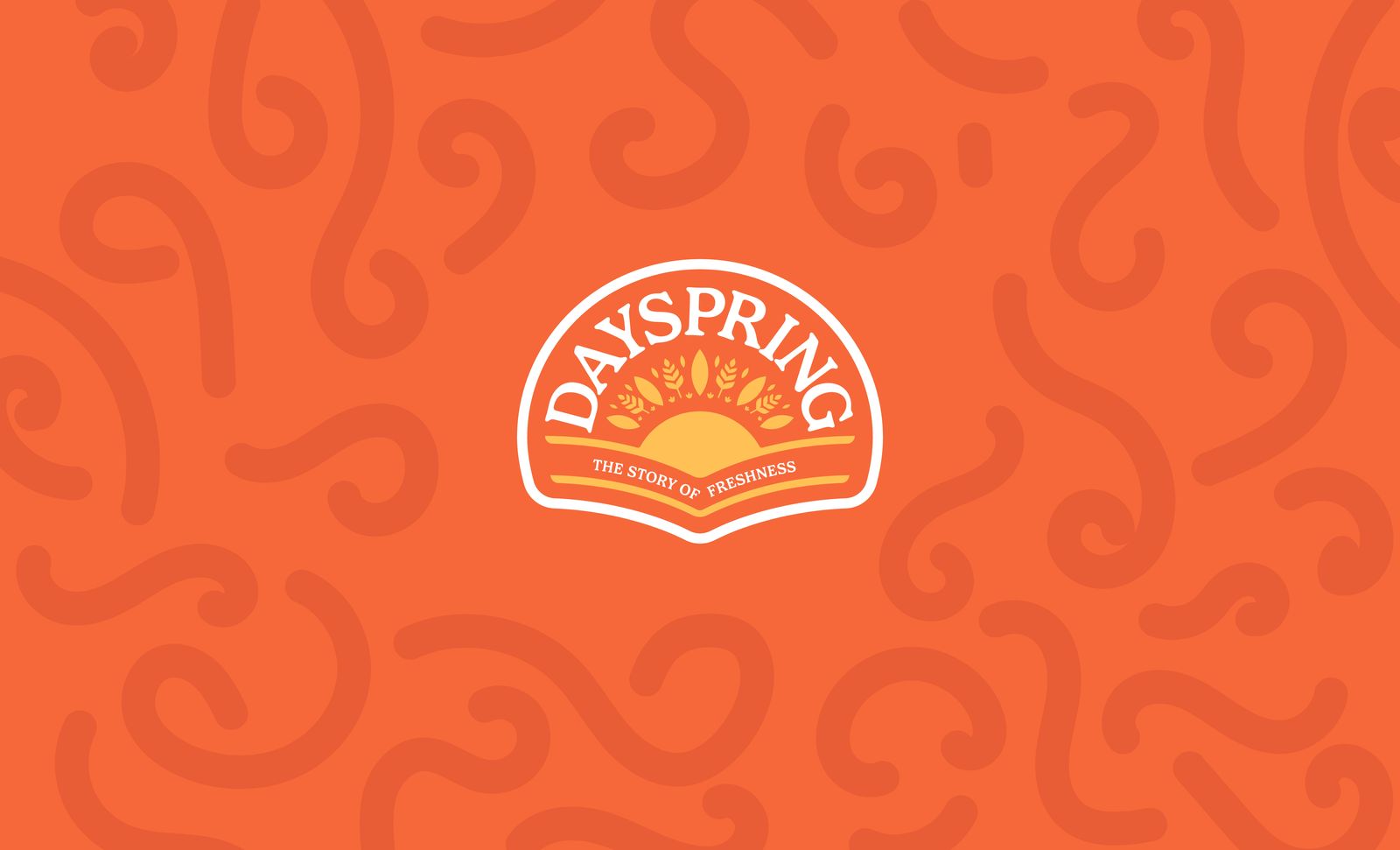
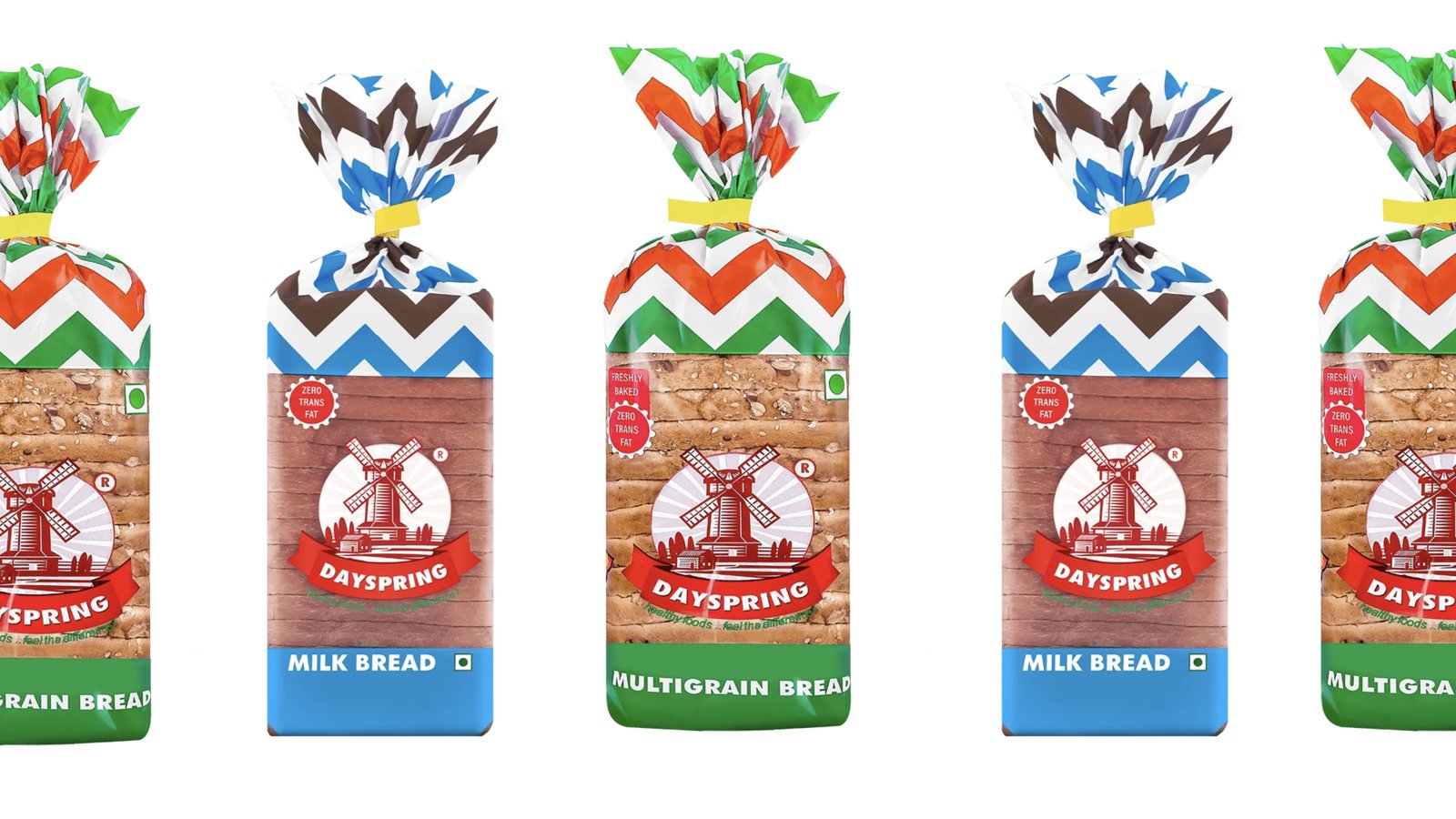
Crafted a Modern yet Traditional Logo using Subtle Everyday Elements
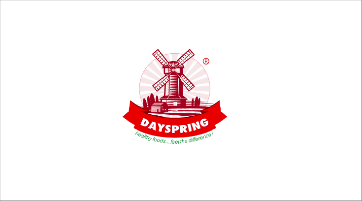
The previous logo featured a windmill, which didn’t resonate with the Indian audience, who associate farms and villages more holistically. We revamped the logo to include elements of the sun and wheat or rice plants, creating a deeper connection with the Indian market. The sun’s rays symbolise the beginning of a new day, perfectly reflecting the meaning behind the brand name, Dayspring.
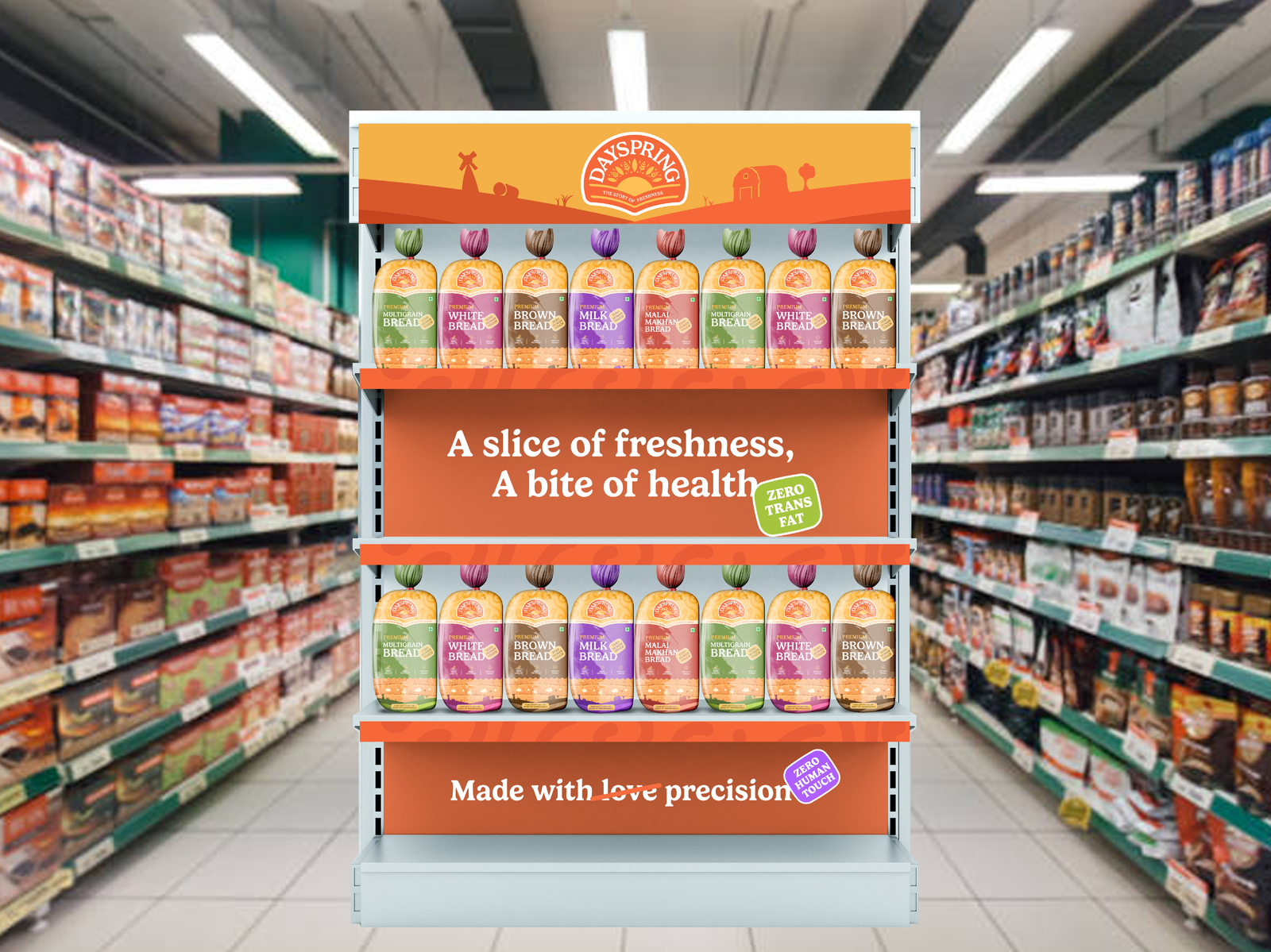
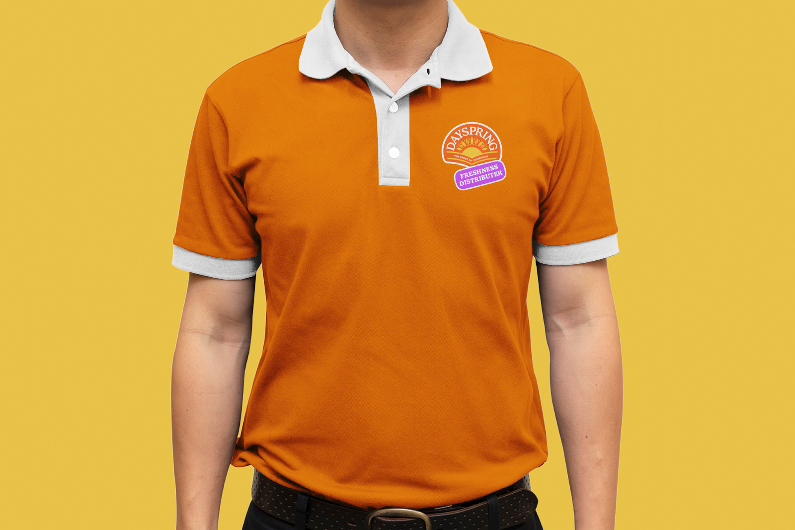
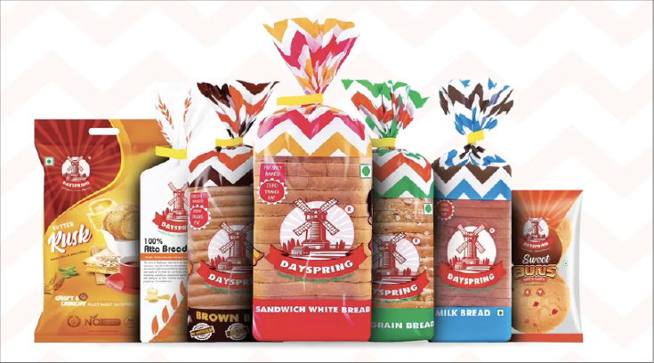
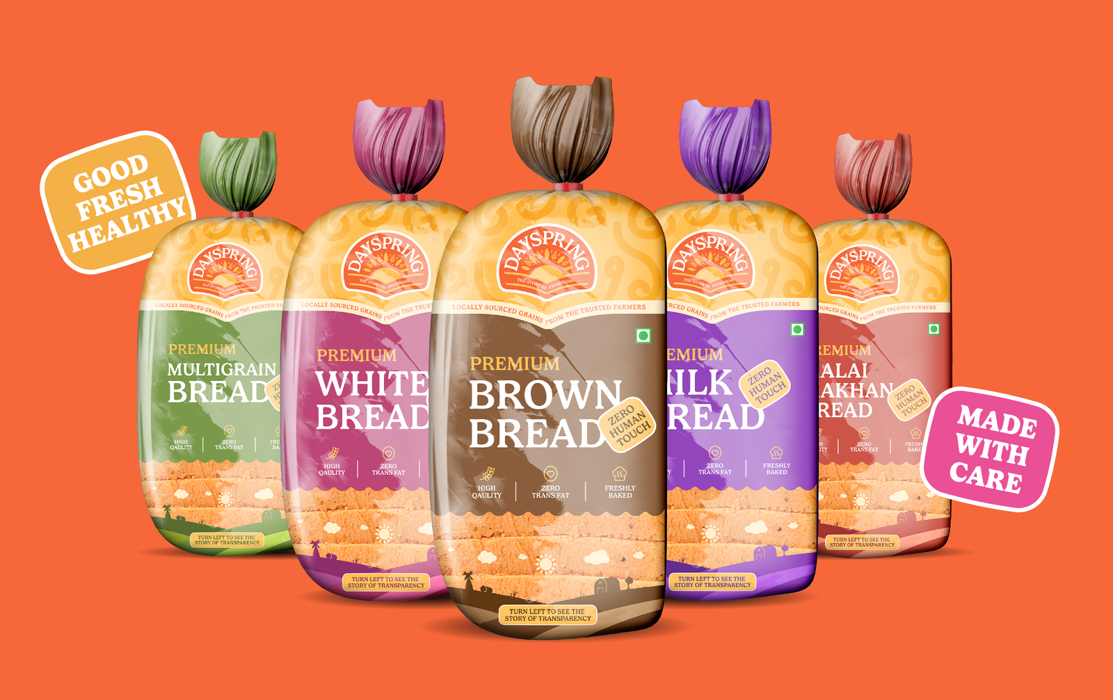
Holistic Approach towards Packaging that can Resonate with every Indian
We strategically used the tagline ‘Zero Human Touch’ to emphasise the clean and hygienic process behind our bread production. Alongside this, we highlighted the product’s three key USPs and the commitment to sourcing grains locally from farmers.
Before
After
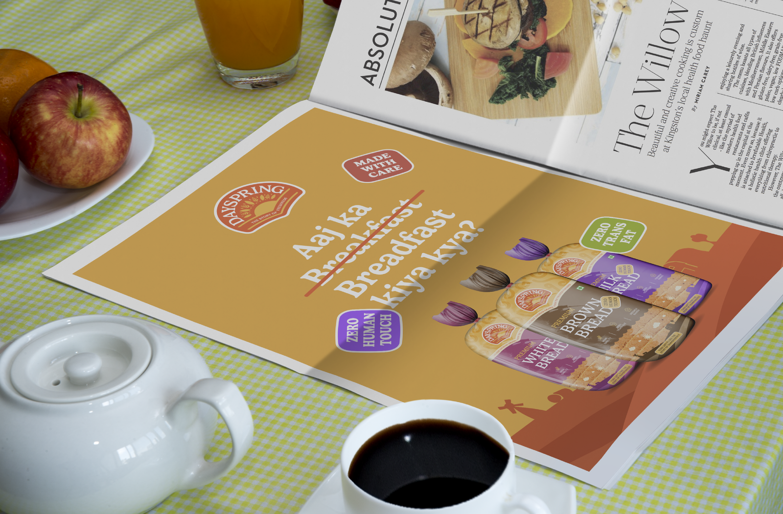
Taking it a step further, we shared the story of transparency, showcasing how Dayspring ensures fresh bread is made with zero human intervention.
 Before
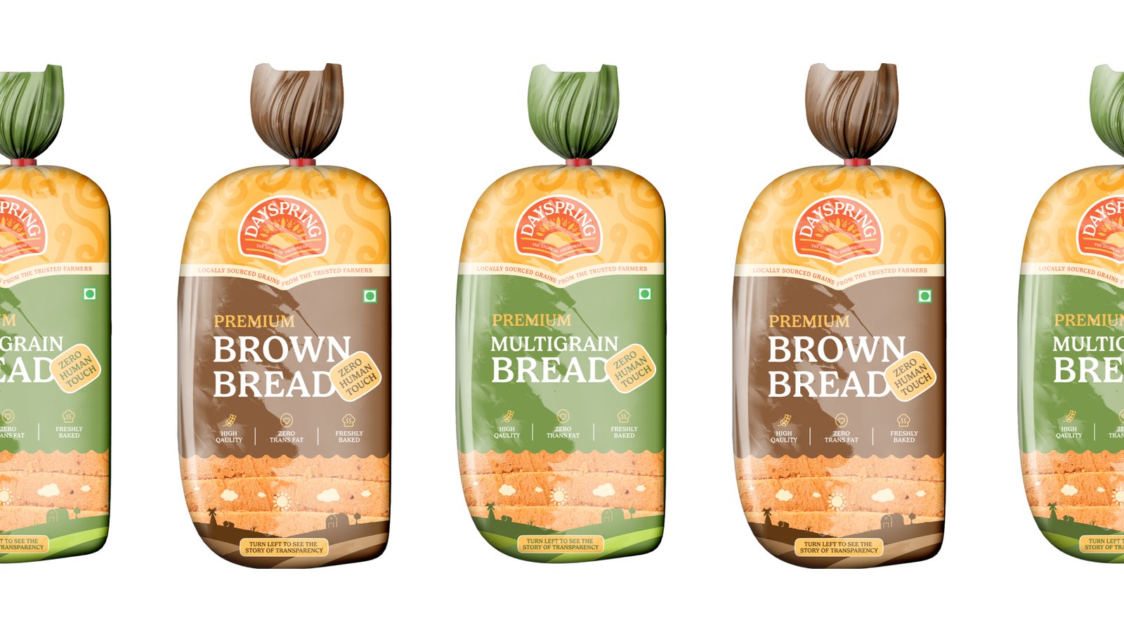 After
After